US/UK Company Page
Goal: Design an English language website geared toward an US/UK audience
Roles: I served as both lead UX researcher and lead UX designer for this project. Responsibilities included:
Compiling a competitive audit, conducting interviews, developing user stories and personas, and conducting usability studies
Paper and digital wireframing, low and high-fidelity prototyping, copywriting, addressing usability study insights, and iterating on designs
Project length: 2-week sprint
Client: 1819 Green is a Venture Capital fund in Singapore which invests in “green” startups and donates to “green” NGOs and non-profits. They want their English language page to appeal to a wider audience globally, and to fit in visually with American VC firms.
Note: Due to an NDA, some details of this project have been changed or omitted. Copy has been changed.
DISCOVERy & definition
USER research
-
Scripted research interviews
Located in USA (remote)
6 participants
30-45 minutes
In order to gain a clear understanding of what users look for in a VC fund’s website, I conducted several interviews of peers of mine who work in the realm of venture capital. These interviews were focused on American users, and consisted of open-ended questions to determine top pain points and priorities.
CONCLUSIONS FROM USER RESEARCH
After conducting interviews and utilizing affinity mapping techniques to categorize subject priorities, I determined that there are certain key elements that make a VC fund’s webpage accessible and informative:
CLEAR MISSION STATEMENT
Users spoke of the importance of a clear mission statement, to help startups match with the right VC funds.
SOCIAL PROOF OF “GREENNESS”
Users stated that funds related to the environment had to show how their portfolio was certifiably green.
TOO MUCH TECH
Many research subjects complained that VC websites often looked too “high tech” or minimalist.
FACES OF FOUNDERS
Users felt that a VC fund page needed to show team members to assist in networking.
USER personas
The next step was to visualize an amalgamation of my interview subjects to create a user persona for 1819Green’s US site. This allowed me to hone in on key challenges and concerns. I developed two User Personas and User Journeys for two common users: Startup Founder Rick, and VC Fund Partner Martin.
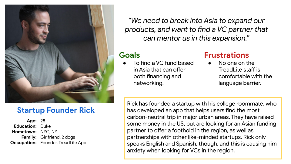
Our Problem Statement: Rick is the founder of a enviro-friendly startup who needs to find a Asian VC fund to raise from because he wants both funding and mentorship when breaking into Asian markets.
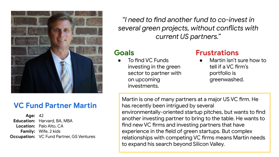
Our Problem Statement: Martin is a VC Fund Partner who needs a way to find new VC funds investing in “green” startups because he wants to build new relationships with experienced, global VC funds.
development
ideation, SKetching, and wireframes
Several ideation exercises, combined with sketching, allowed me to play with different layouts for the Investments pages (NGO and Seeded Startups). Examining the competition inspired many basic layouts; one of the challenges yet to address is what to do for startups/NGOs that do not have their own icons or logos.
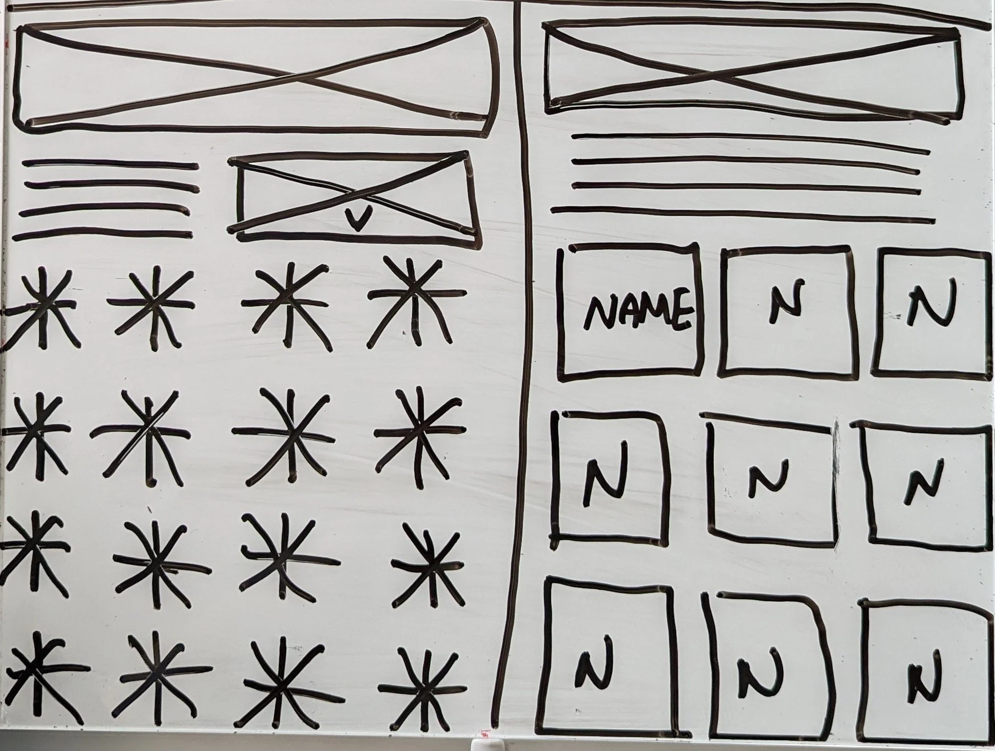
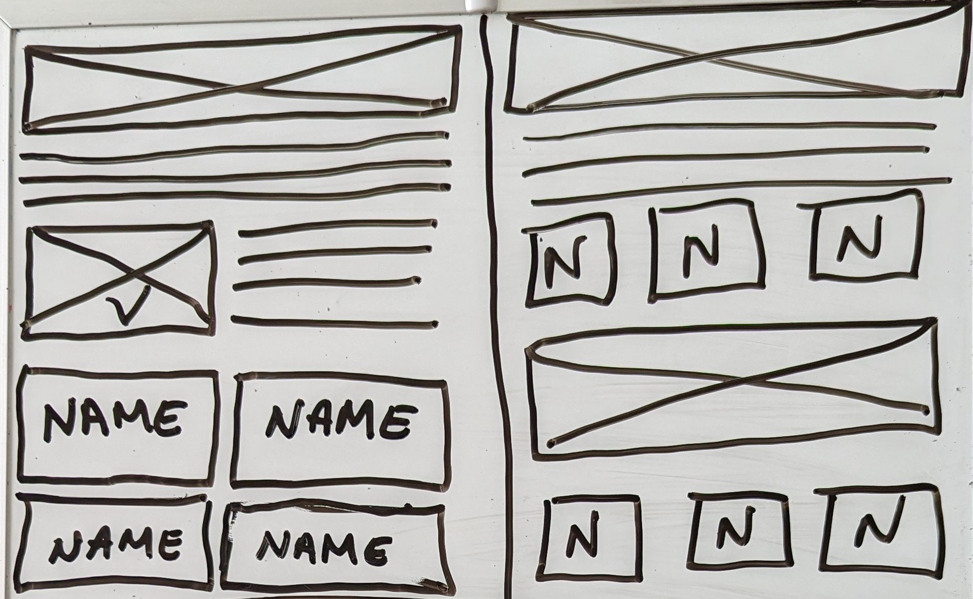
lo-fi wireframes
Paper wireframes were then translate to digital form using Figma. Using the completed set of digital wireframes, I created a low-fidelity prototype to interact with during user testing.
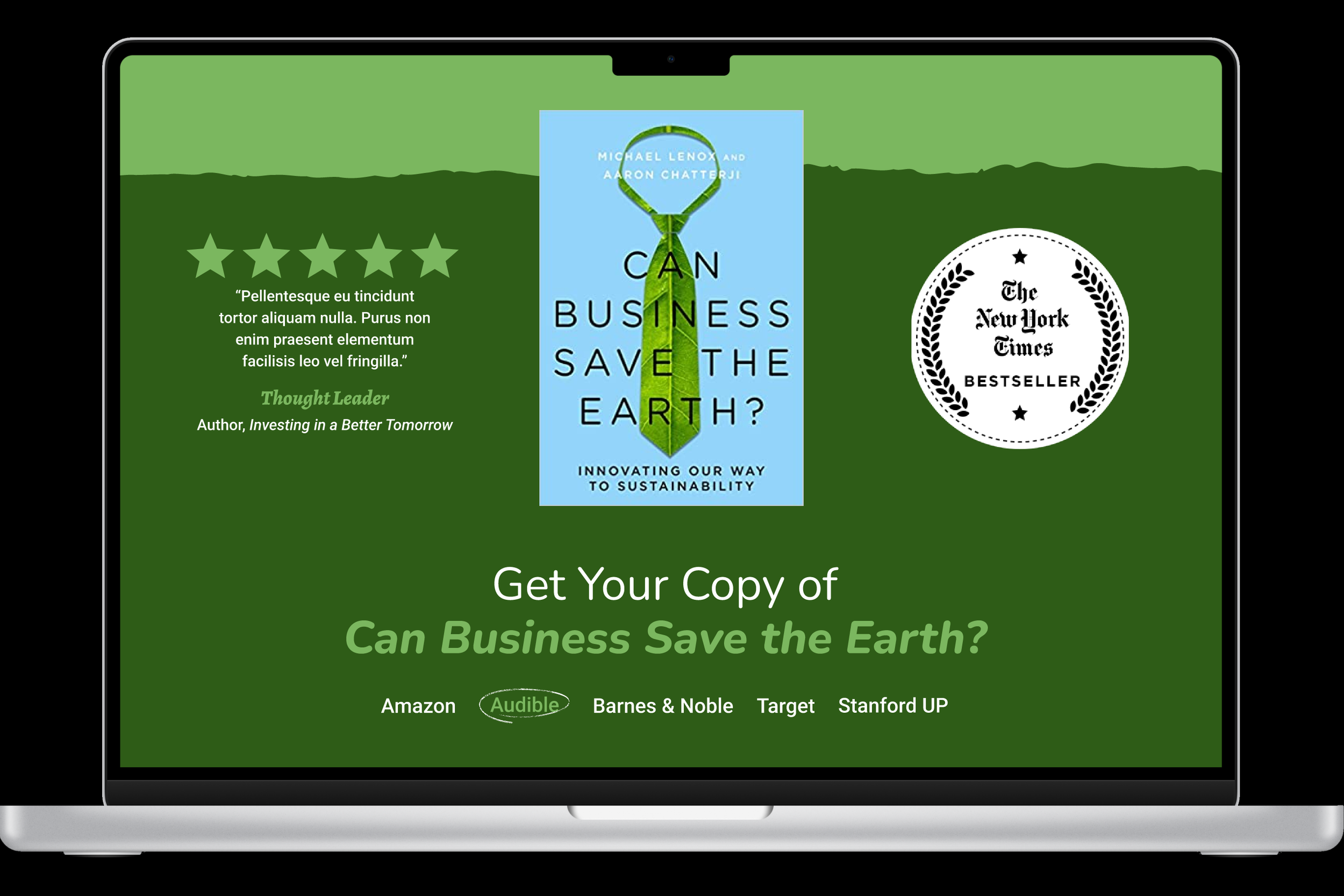
Since there is a very common formula for book landing pages, I wanted to design a page that could serve as that landing page while also offering social proof for the fund as a whole.

usability testing
-
Unmoderated usability study
Located in USA (remote)
6 participants
20-30 minutes
Once a lo-fi prototype was ready, it was run through an initial round of usability testing. Subsequent usability testing would utilize a similar format. Several key insights would shape the final lo-fi prototype, and would be carried into the hi-fi version.
SPLITTING INVESTMENTS
Users were overwhelmed seeing both types of investments (NGO and Seeded Startups) on the same page.
NETWORKING & CONNECTION
Users wanted to connect with specific team members, but could only find generic contact information.
MORE CONNECTIVITY
Users wanted more opportunities to move from page to page without resorting to the nav bar.
translating insights into prototype
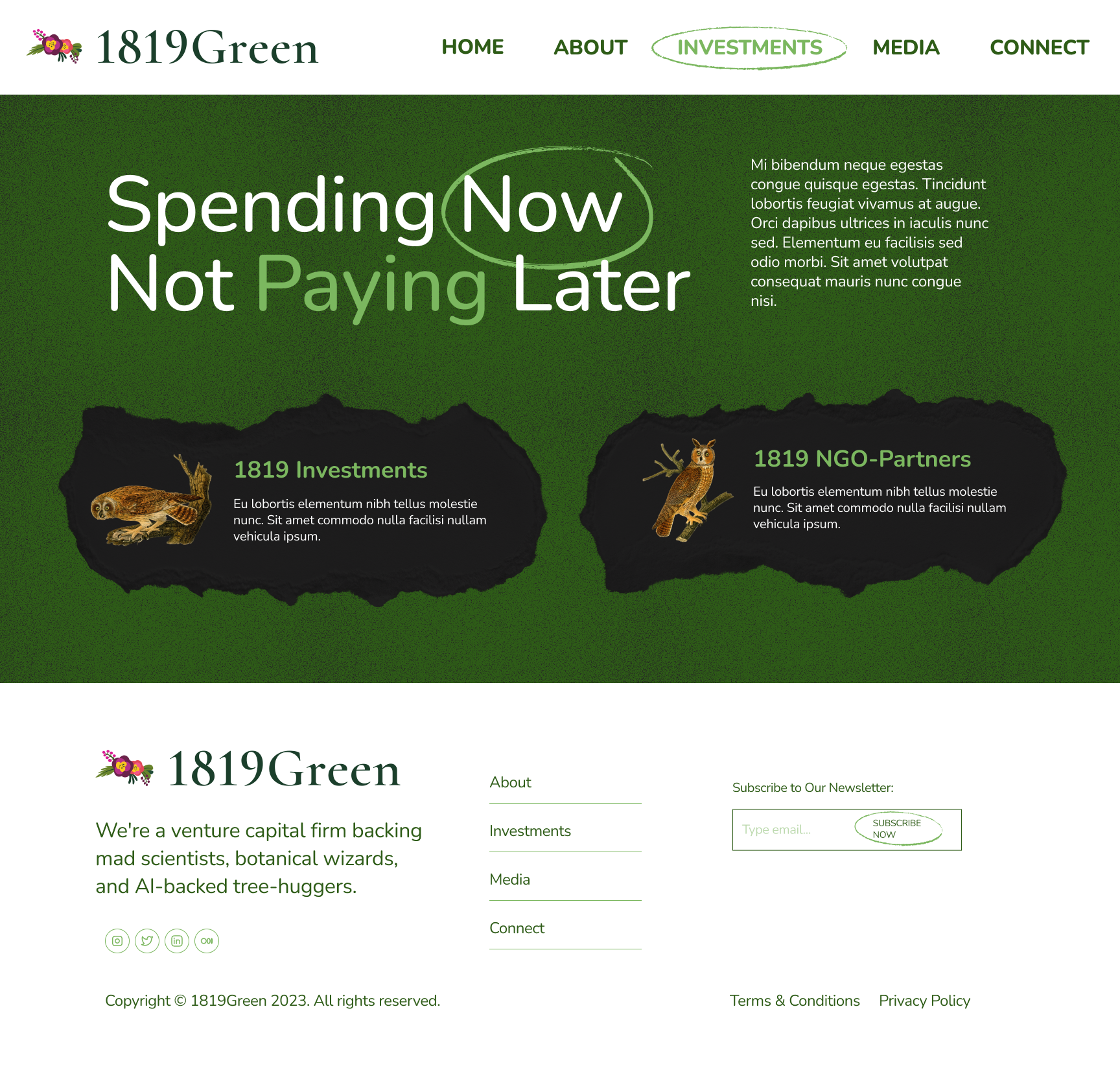
The initial Investments Page was split into two separate pages: NGOs Page and Startups Pages.
Later iterations would also include a separate Investments Landing Page which directed users to either the Startups Page or the NGOs Page.
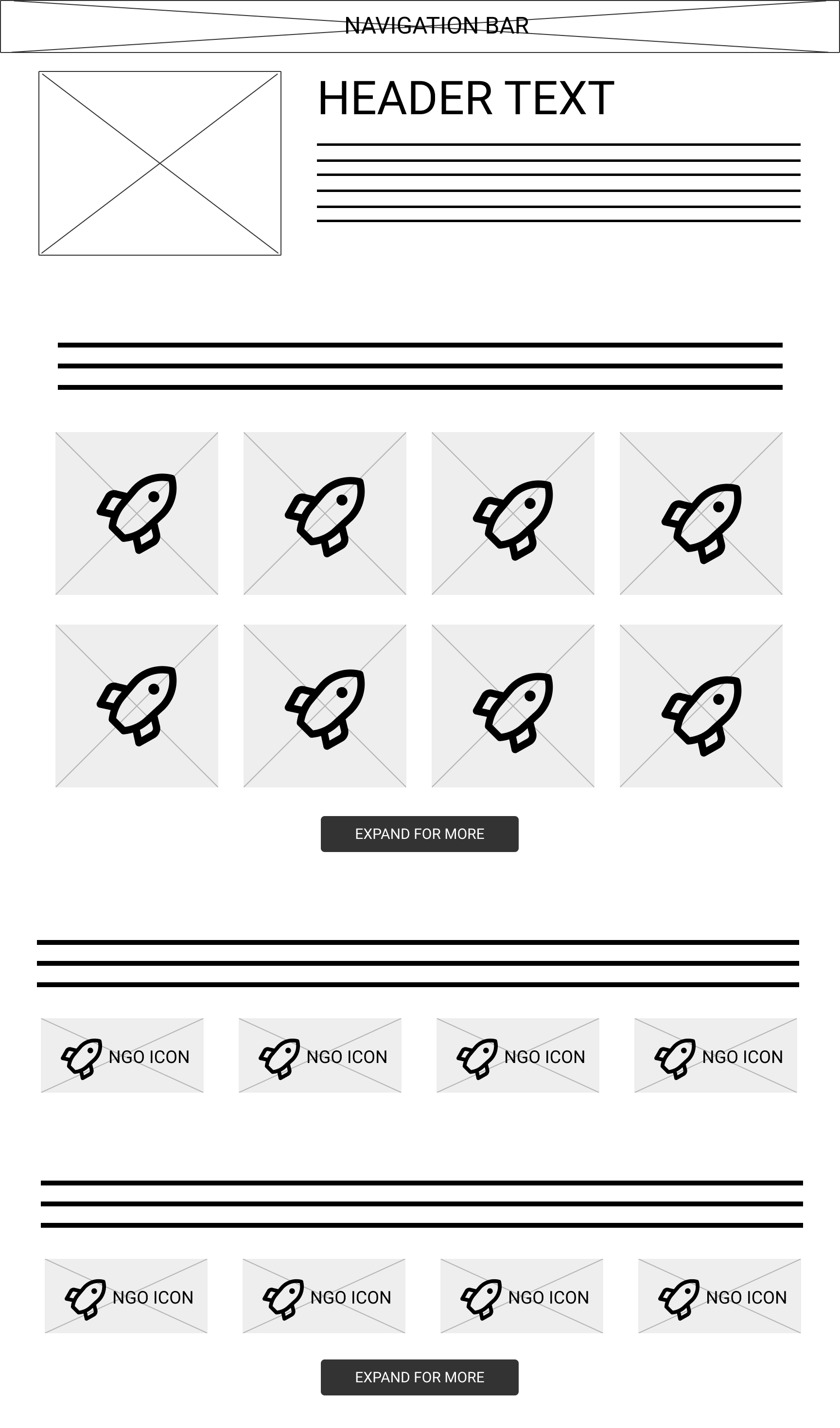
new startups PAGE
NEW NGOs PAGE
delivery
hi-fi prototype
After finalizing the layout of each feature and deciding on the visual design direction, I was ready to create the hi-fi prototype for the desktop version.
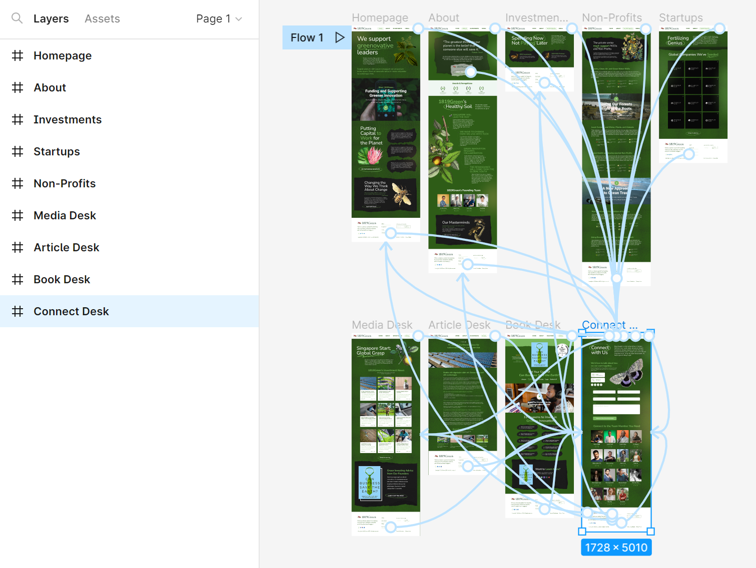
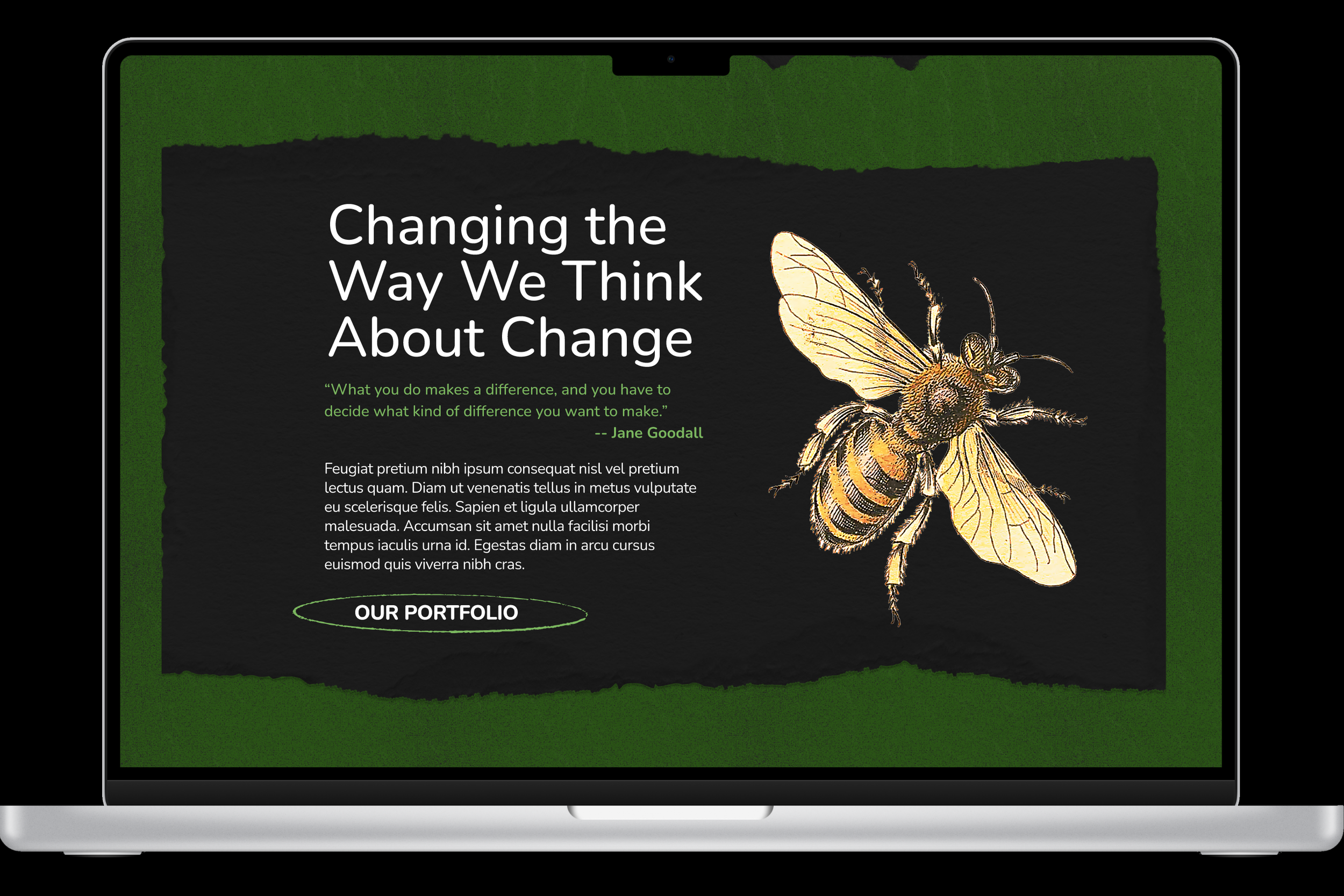
HOMEPAGE
Cutting edge video was mixed with vintage botanical images to represent Singapore’s unique identity.
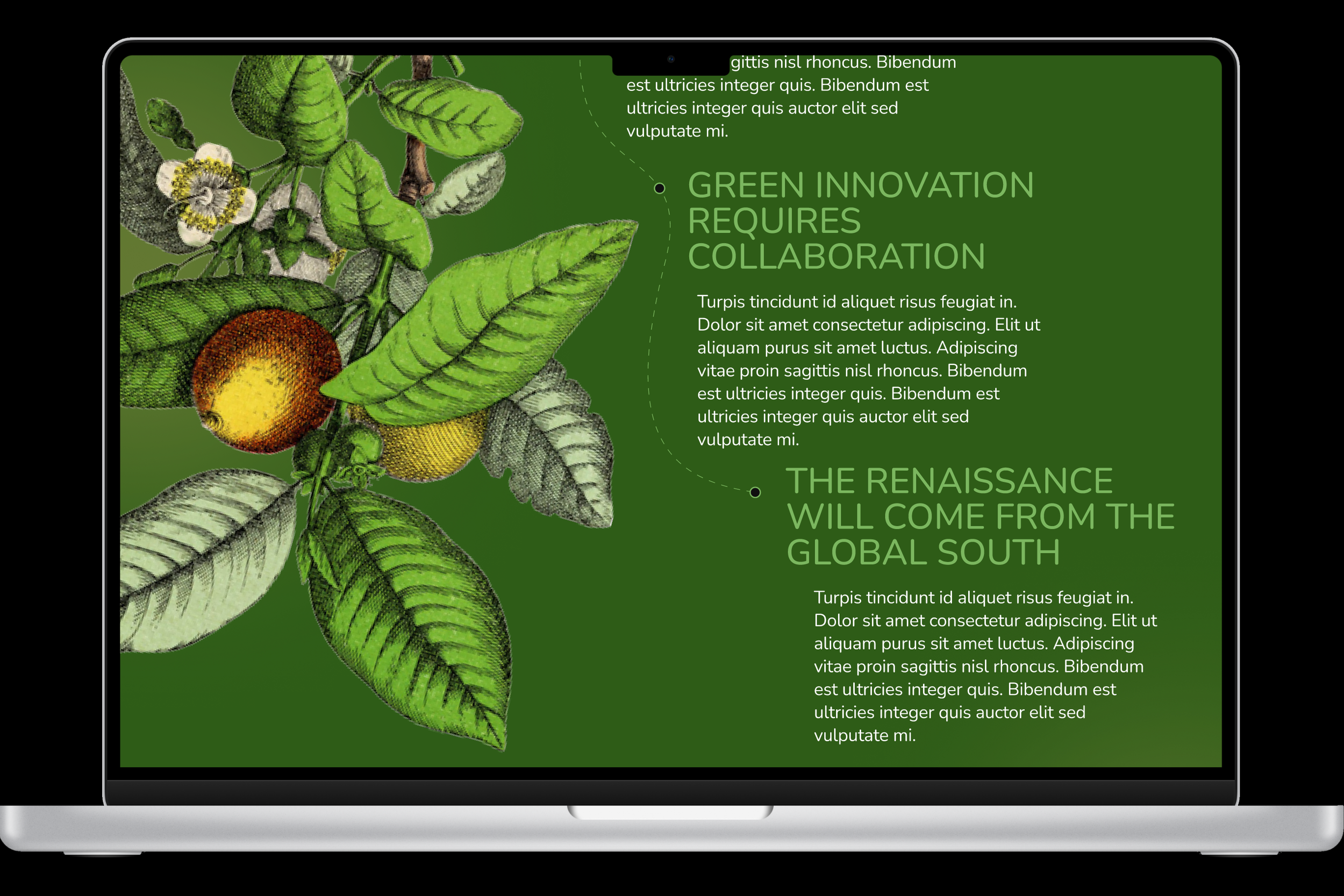
ABOUT PAGE
I wanted to emulate a tree branch presentation for the mission statement, subliminally signaling growth.
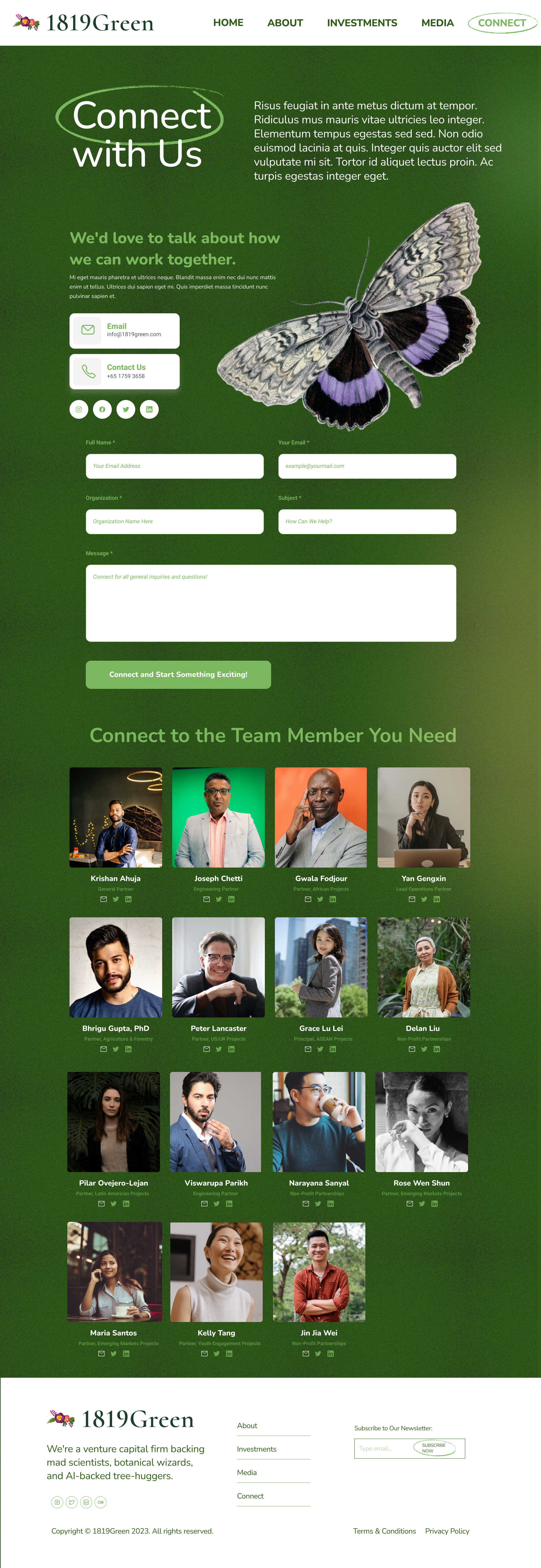
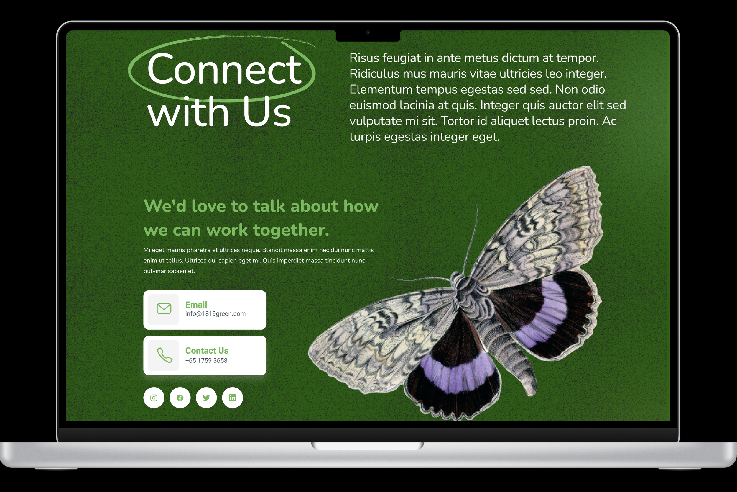
CONNECT PAGE
By putting the partners’ images and contact info on the connect page, the user can more easily find exactly who to message.
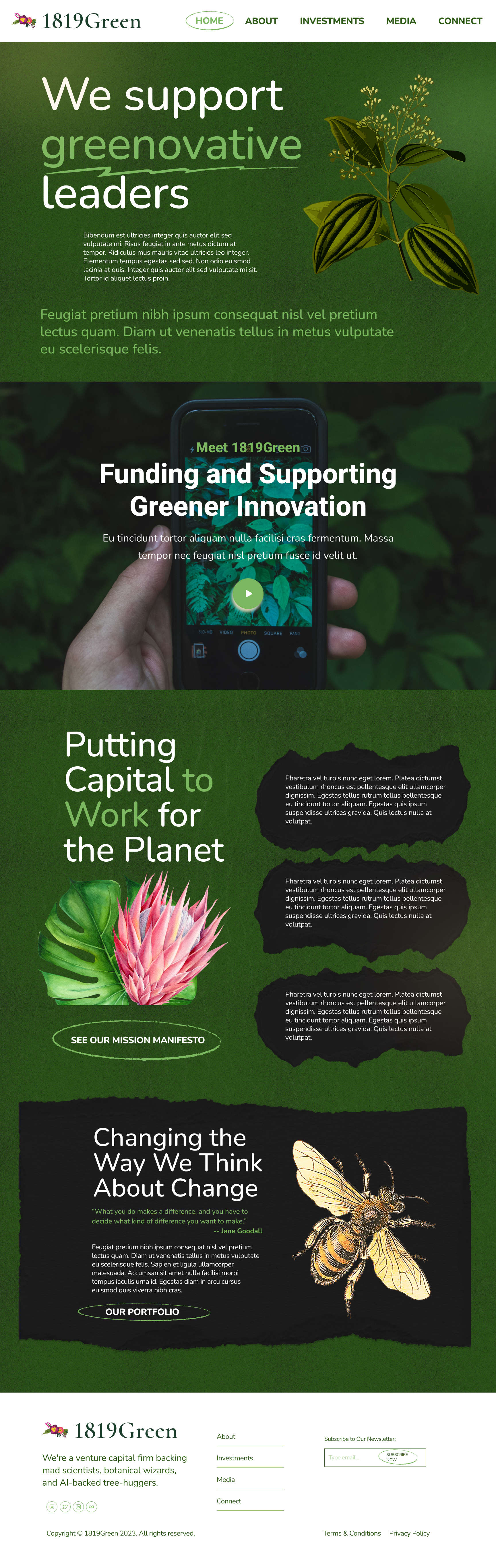
HOMEPAGE

about page
connect page
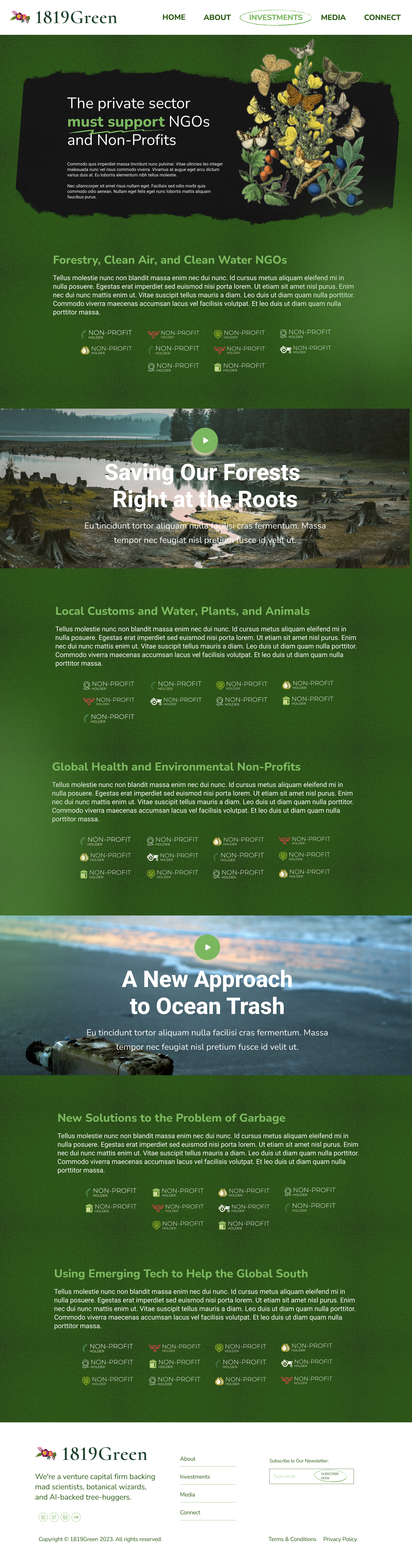
INVESTMENTS HOME PAGE
Users preferred having startup investments and NGO partners on separate pages. This necessitated the creation of a simple but fun Investments home page to direct users to either the Startups or NGOs Pages.
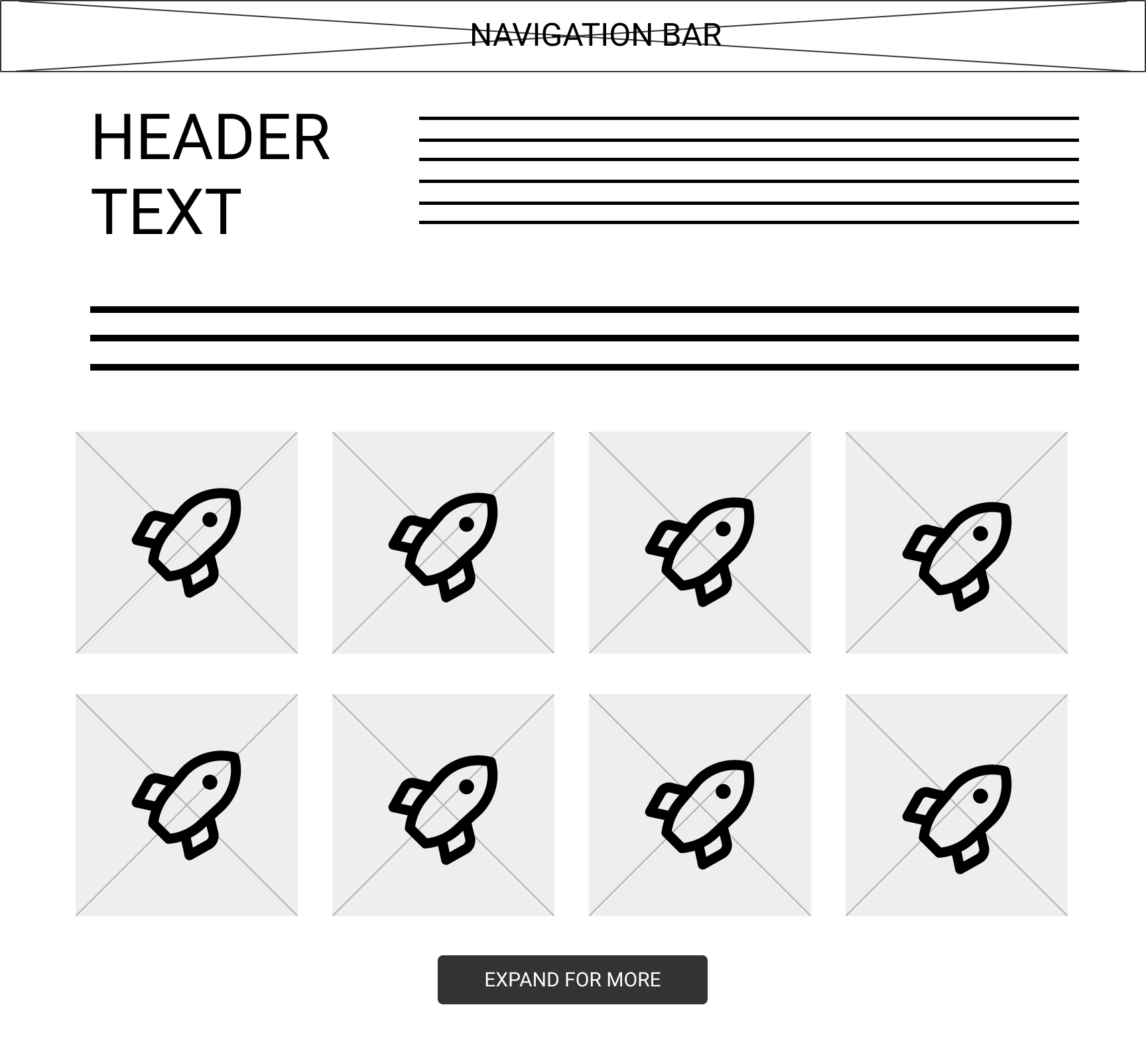
STARTUP LIST PAGE
I wanted a clean, capsule feel to the page, with each company represented equally and professionally.
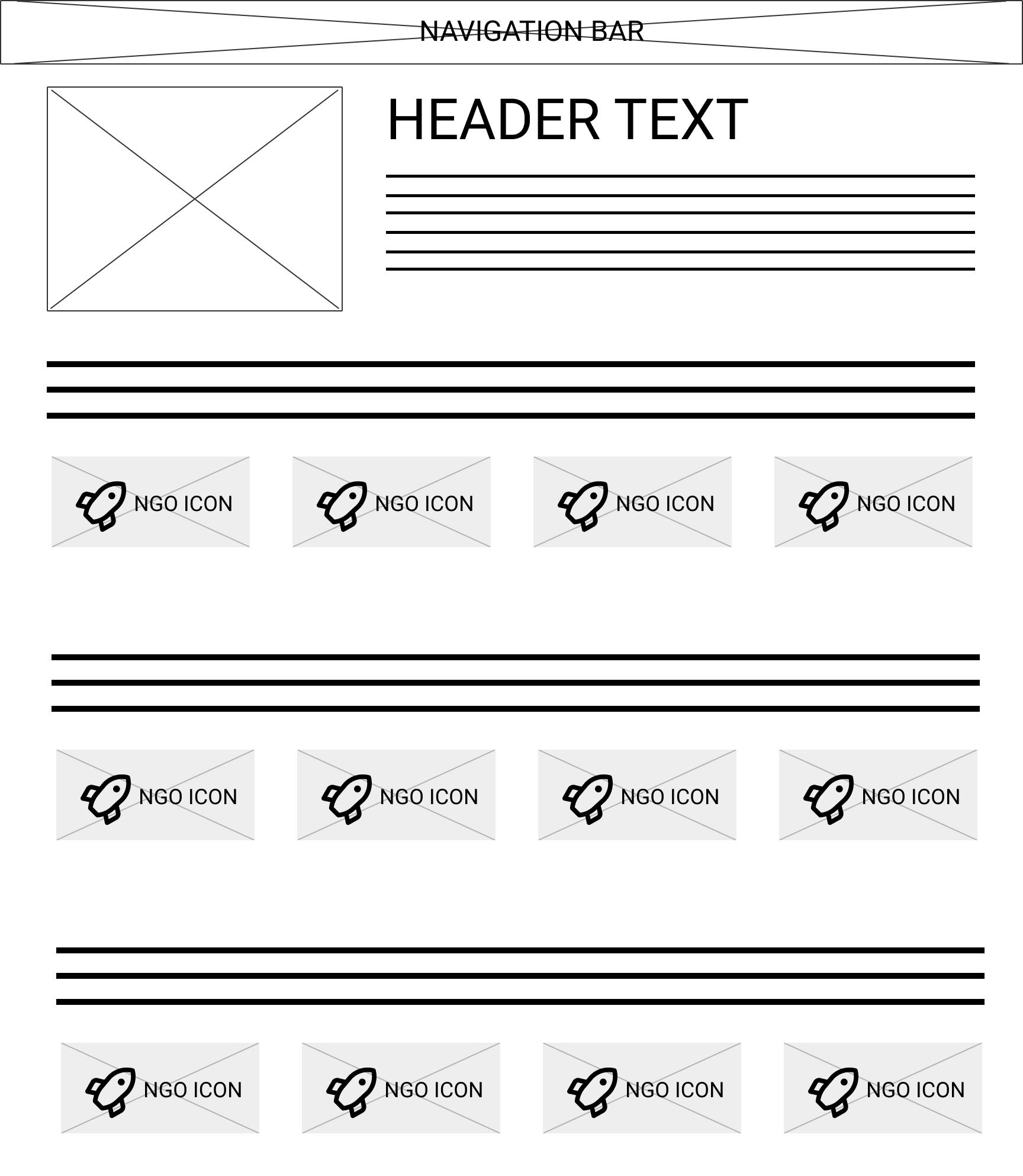
NGO/NON-PROFIT LIST PAGE
Once this page became expanded, I focused on using it as an opportunity to tell more stories about the amazing work the NGOs were doing. Adding more copy and video content allowed 1819Green to add a human element to their NGO partnerships.
INVESTMENTS HOME
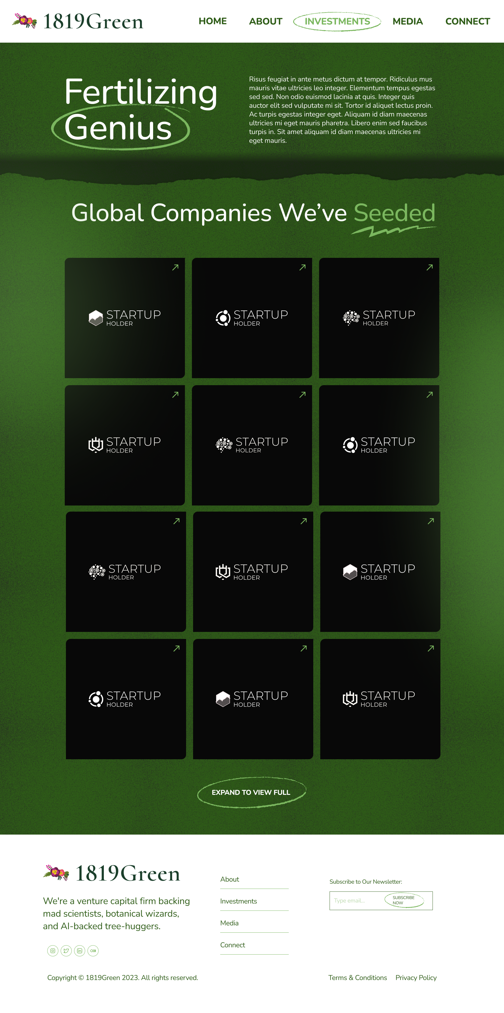
STARTUP LIST PAGE
NGO LIST PAGE
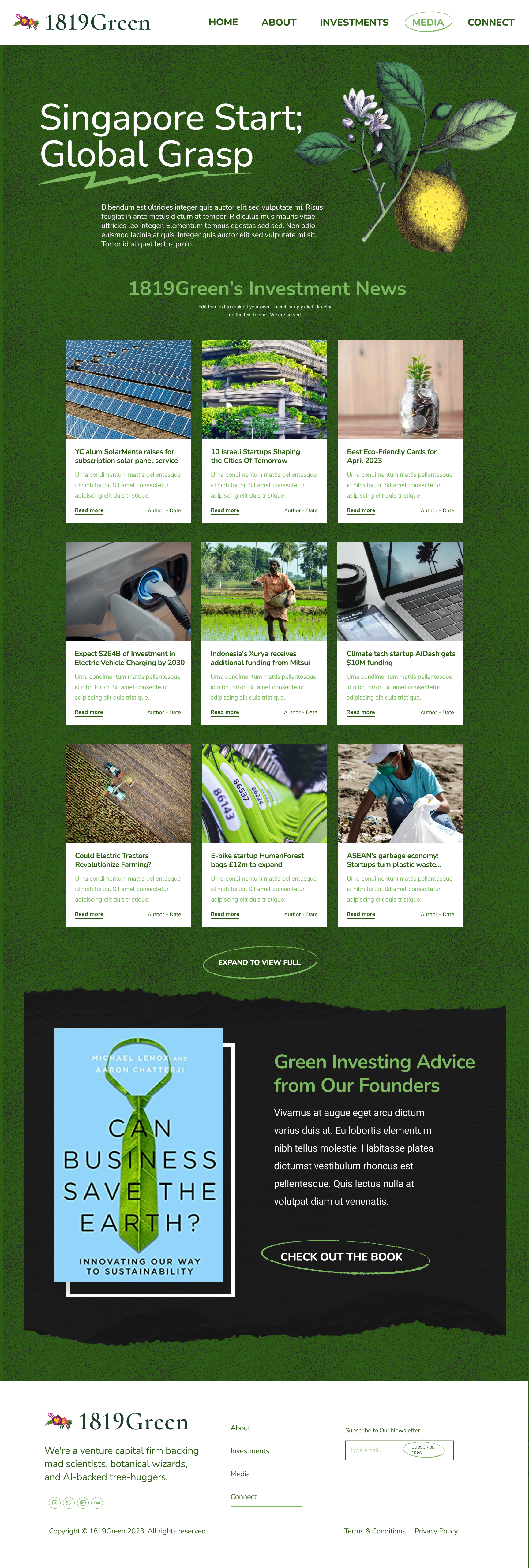
MEDIA PAGES
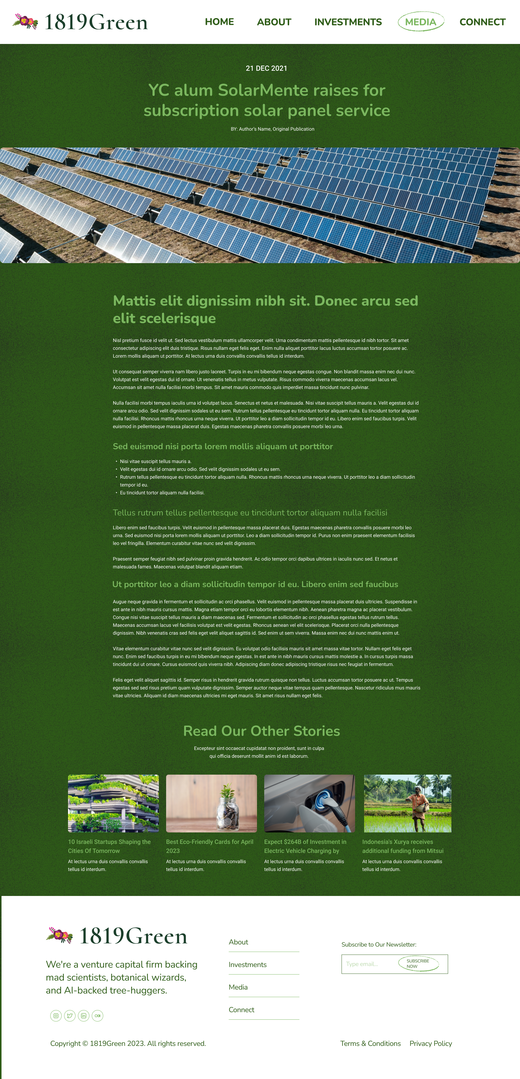
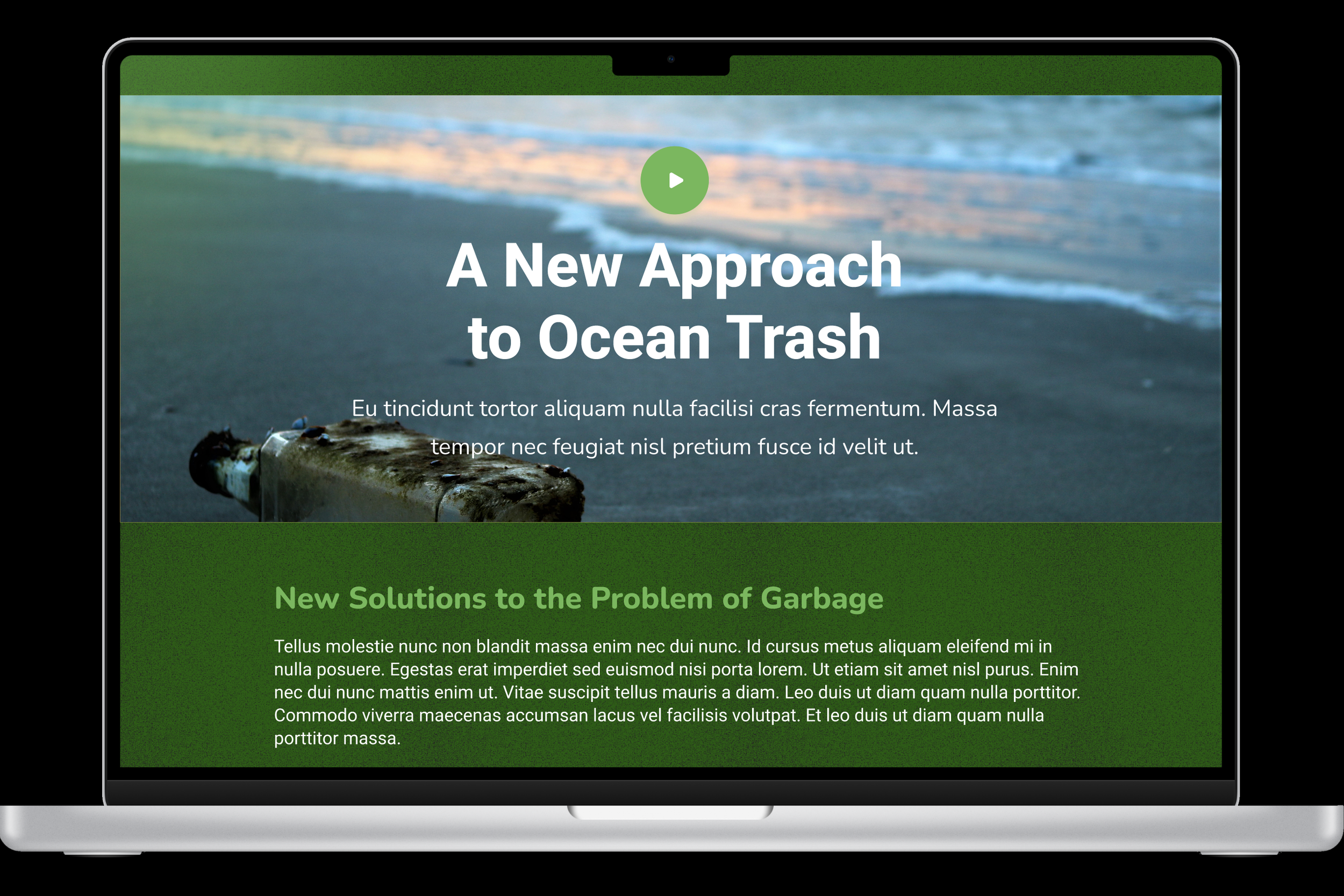
The client wanted a way to share their own media. I suggested that they connect with the companies in their portfolio and funnel content from those companies’ blogs/press pages into 1819Green’s own media center. This allowed us to build a large library of content for 1819Green almost overnight.
An article template allowed 1819Green to standardize media content from portfolio companies and create a unified, clean look.
The founders of the company have a small book originally published in Singapore but now available on Amazon. By featuring the book on the site, 1819Green was able to demonstrate their expertise to a new audience.
mEDIA page
gENERIC aRTICLE TEMPLATE
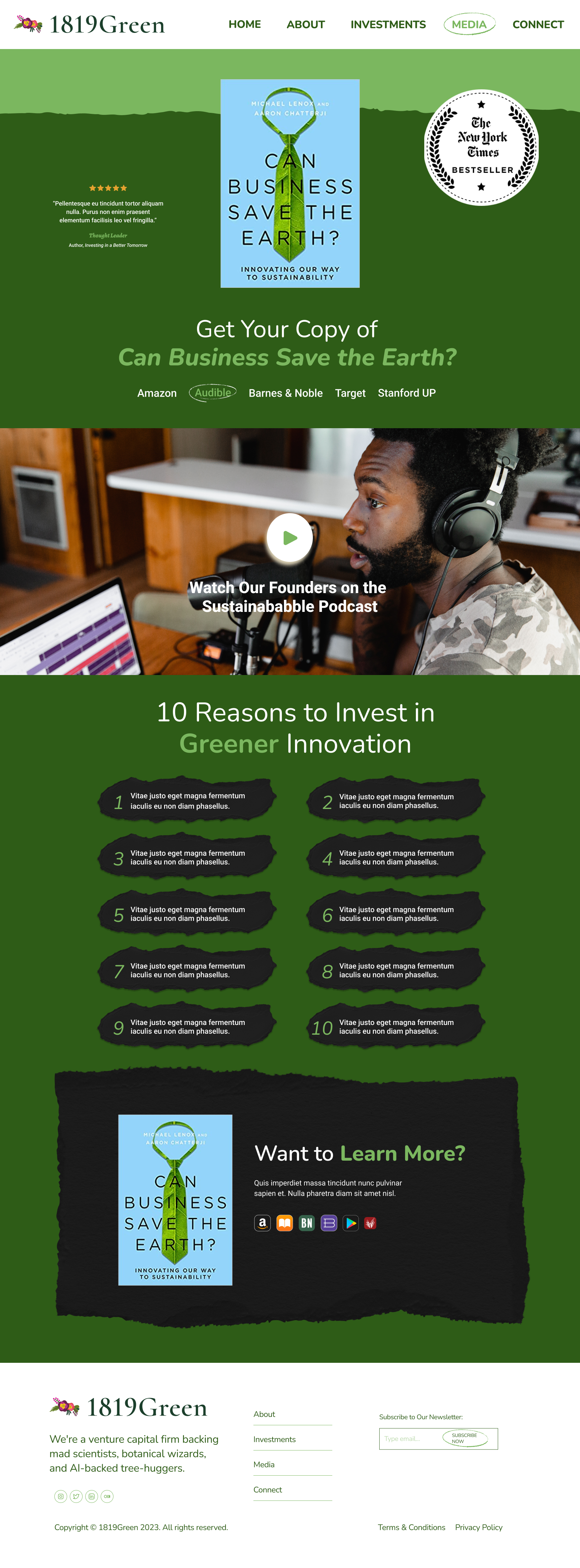
FOUNDERS’ BOOK LANDING PAGE
VINTAGE TOUCHES
Singapore has a strong cultural connection to the natural sciences, and I wanted to reflect 1819Green’s unique identity as a nature-first, tech/finance-second VC firm.
The result was an elegant aesthetic that strongly differentiated 1819Green’s page from its competition.
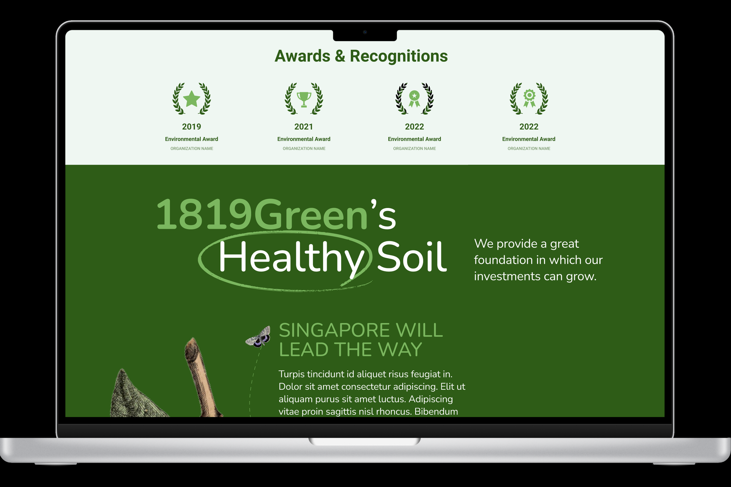
SOCIAL PROOF
Both the client and subjects of initial research expressed the need to see some form of “social proof” on the website, in order to validate a Singaporean fund to a predominantly US audience.
To achieve this, new video content was requested from the client, showing the impact of their investments.
Additionally, awards and the founders’ book, both signifiers of expertise, were displayed on the site.
These additions are a bit of a departure from competing VC fund websites, but not unusual for international NGO websites. 1819Green’s crossover appeal will benefit from the fusion of styles and variety of accolades.
FINAL PROTOTYPE
After several rounds of usability testing (with potential users and the client), a final prototype was completed and submitted.
With its bold look and social proof, 1819Green’s new US/UK website will be a strong introduction to Silicon Valley.