Desktop rebranding
Goal: Design new landing, informational, and product pages for GlobalSpice, while elevating the brand.
Roles: I served as both lead UX researcher and lead UX designer for this project. Responsibilities included:
Conducting interviews, developing user stories and personas, and conducting usability studies
Paper and digital wireframing, low and high-fidelity prototyping, rebranding, addressing usability study insights, and iterating on designs
Project length: 3-week sprint
Client: GlobalSpice is a growing international spice shop offering fair trade spices from several countries. They needed a significant site overhaul to improve their user experience. They were happy with their sales screens already, so I focused on revamping their homepage, narrative pages, and product categories. GlobalSpice also wanted a far more colorful, visual design that would make them stand out to both customers and partners.
DISCOVERy & definition
USER research
-
Scripted research interviews
Located in USA (remote)
7 participants
30-60 minutes
-
Email Survey Open-Ended Questions
Translations via Google Translate
9 participants (3 per country)
CUSTOMERS
GlobalSpice was founded before the pandemic, and as such, boasts a small but dedicated customer base that provided excellent interview subjects. Through virtual structured interviews, I was able to talk to five customers about what they liked and didn’t like about the current GlobalSpice site, and what changes they would like to see. I was also able to interview two restaurant owners who were not customers to ask what they would look for in a site like GlobalSpice, to understand what potential customers might be looking for. These interviews yielding some helpful insights:
Customers were most frustrated with the fact that the existing site is organized by quantity (bulk/small) and type of spice (heat, warming, cool). While this is intuitive for a chef, this was not preferable for the restaurant managers, who are the actual purchasers and the real target audience of this website.
Customers wanted to limit shipping costs, so preferred to order from only one or two spice providers. Often restaurants only sold one type of cuisine, so only wanted spices from that region (Latin American, Arab, SEAsian, etc). This led many customers to suggest grouping spices by country and seller.
Customers wanted to better understand who they were buying directly from; many suggested more videos and photos of the farmers themselves.
PARTNERS
GlobalSpice already features strong partnerships with spice growers in three different countries (Morocco, Malaysia, and Mexico), and the client wanted me to connect with those partners to understand what they wanted in a rebranding and new UX/UI. Since these partners were comfortable with email, but spoke a wide variety of languages, I determined that it was best to create a survey that could be translated directly for each partner with open-ended questions they could answer. These were then translated back to English and analyzed, providing the following insights:
Partners were actually very happy with their interfaces/dashboards for entering their products and managing their sales. These were developed within each country, and local company reps taught them to partners. Many expressed anxiety about changing those dashboards. It was decided, with the client’s approval, not to rebrand that “backend” side of the site.
Partners wished that they had their own feature page where they could show their farms or families to customers. As partners have become more engaged with social media (through GlobalSpice’s marketing support), they are more aware of the power of having their own website. They want a way to showcase their story. The client agreed that this was a natural evolution of their company’s mission to empower Global South entrepreneurs.
CONCLUSIONS FROM USER RESEARCH
Affinity mapping of the results of user interviews and surveys identified several pain points. These could be addressed in a fundamental restructuring of the IA of the website and UI. The following pain points were selected as top priorities.
POOR ORGANIZATION
Users felt categories and filters were not aligned with shopping habits.
LACK OF NARRATIVE
Users wanted to “feel better” about buying fair trade, and wanted to know who they were buying from.
FARMER FOCUSED
Users and partners wanted more opportunities to share in the stories of Global South farmers and entrepreneurs.
USER persona & journey
After interviewing several of GlobalSpice’s existing customers, I found that two different archetypes of users emerged which would become user personas:
Home chefs and small restaurant owners who are buying small quantities and are passionate about the story behind the spice
Large restaurant managers or shop vendors who are buying in larger quantities and care about high quality
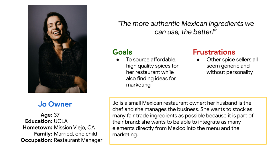
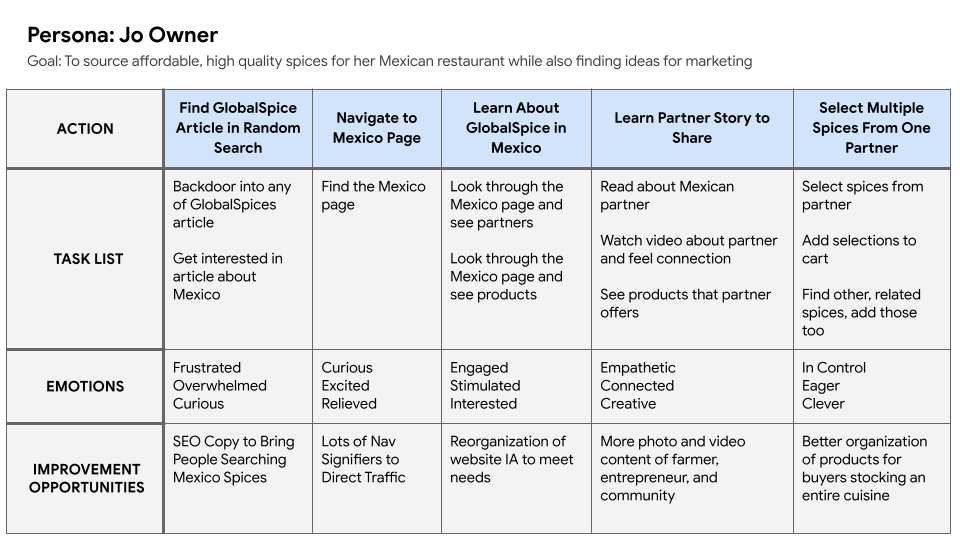
Our Problem Statement: Jo is a creative restaurant manager who needs a way to buy Mexican spices direct because she wants to include authentic ingredients and storytelling in her restaurant.
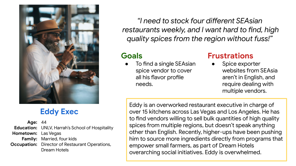
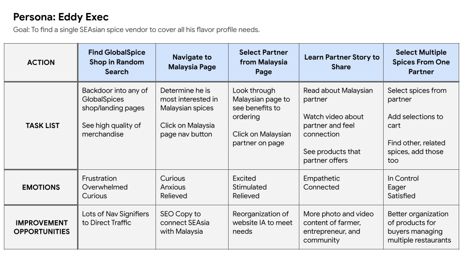
Our Problem Statement: Eddy is an overworked hospitality group restaurant director who needs an easier way to buy hard-to-find ingredients direct because he is can’t manage the stresses of working with numerous foreign exporters.
development
ideation, SKetching, and wireframes
I did several quick ideations exercise to come up with ideas for the country homepages. The central question was which information we wanted to present above the fold, and how much video content could be added. Sketching allowed me to envision the pages without getting bogged down in all the visual content we had to put on the page.
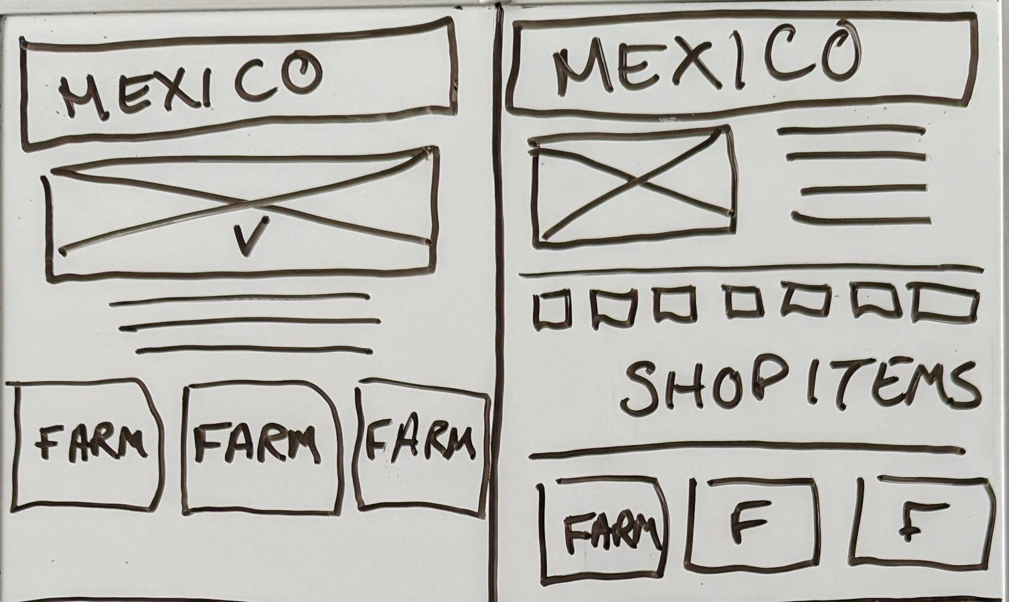

lo-fi wireframes
Paper wireframes were then translate to digital form using Figma. Using the completed set of digital wireframes, I created a low-fidelity prototype to interact with during user testing.
Emphasis was placed on strategic placement of videos and personal stories, as well as simple design.
usability testing
-
Unmoderated usability study
Located in USA and Mexico (remote)
12 participants
20-30 minutes
Once a lo-fi prototype was ready, this was tested through an initial round of usability testing. Subsequent usability testing would utilize a similar format.
Several key insights would shape the final lo-fi prototype, and would be carried into the hi-fi version.
WHY?
Users wanted a page which explained the benefits of fair trade shopping.
COUNTRY PROFILES
Partners wanted farmer information to be equitably distributed on the page.
MORE NAVIGATION
Users wanted more opportunities to navigate directly to a country page.
translating insights into prototype
Insights from usability testing were integrated into the final lo-fi prototype.
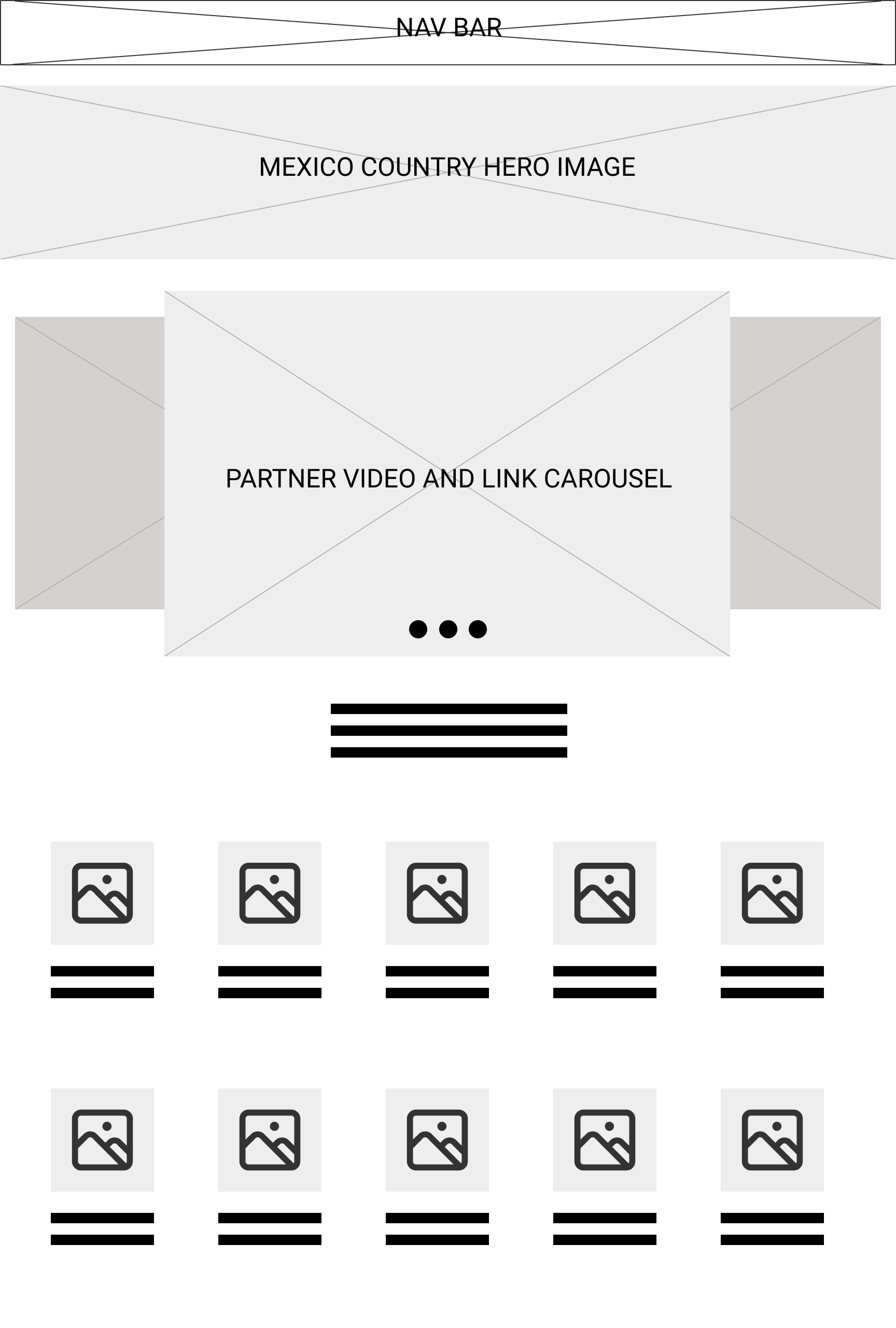
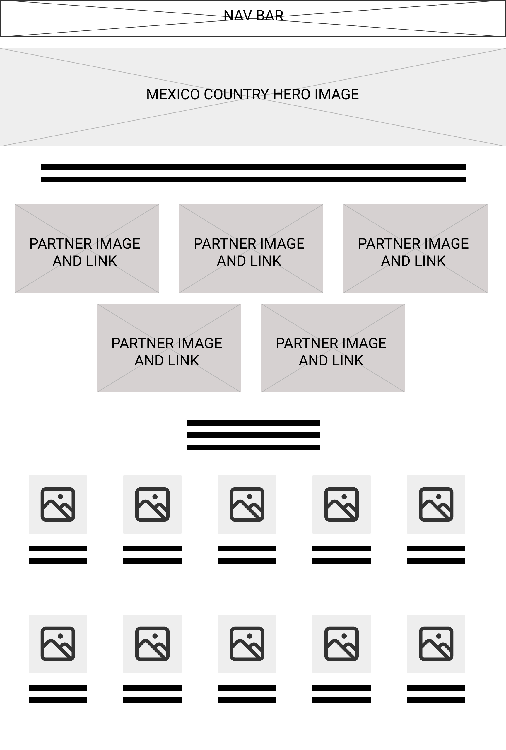
Partners did not like the carousel - many did not understand how it worked, and all stated, in some form, that they felt like it gave too much emphasis to which partner was the first feature.
To solve, I created a more egalitarian design - but this will need to be reexamined when a given country has more than 5 partners.
before input
after input
delivery
BRanding & Palette
GlobalSpice was in need of a branding facelift, and wanted something that resonated with both loyal customers and global farming partners. I developed several palette boards which were then featured in an email survey sent to both repeat customers and partners. Their input provided insight into what GlobalSpice had been missing: a clean, warm, and tropical color scheme with handwritten touches.
-
Email Survey Through Mailchimp
Both Ranking & Open Ended
US Customers
Partners in Morocco, Mexico, and Malaysia
87 responses
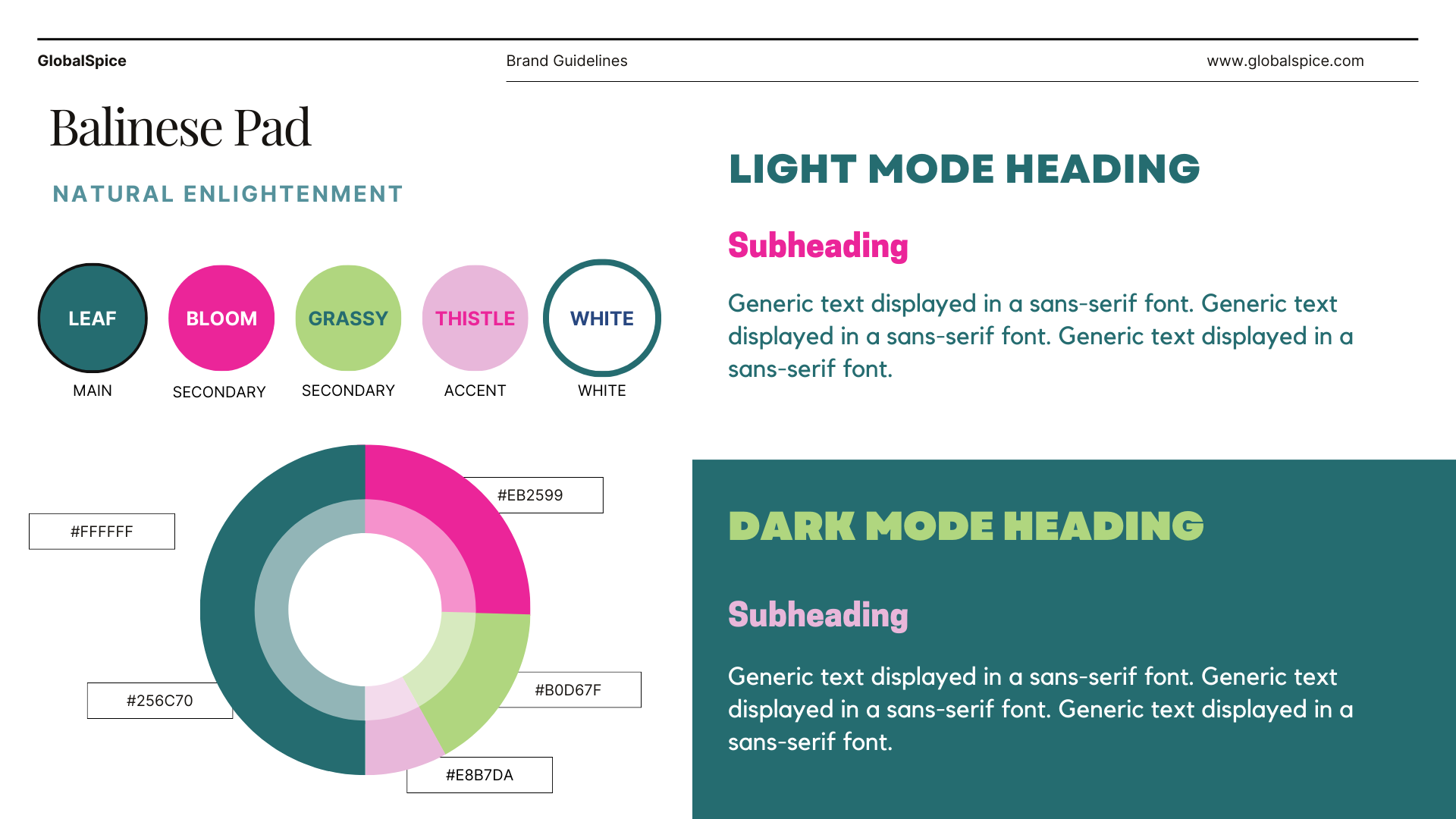
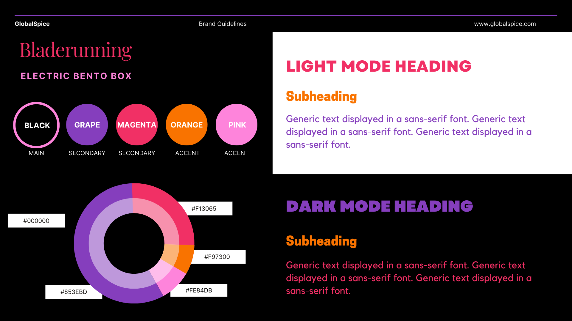
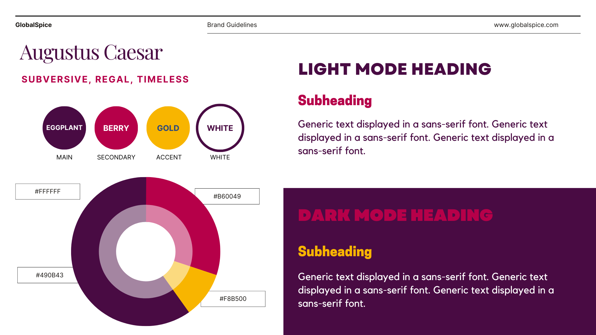
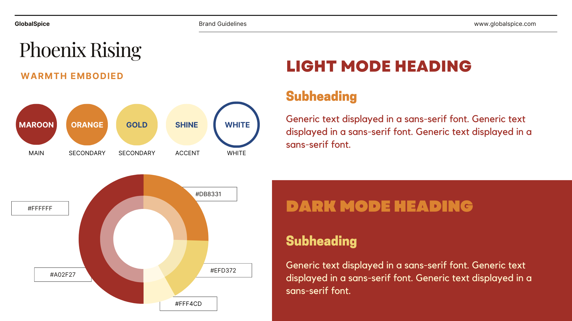
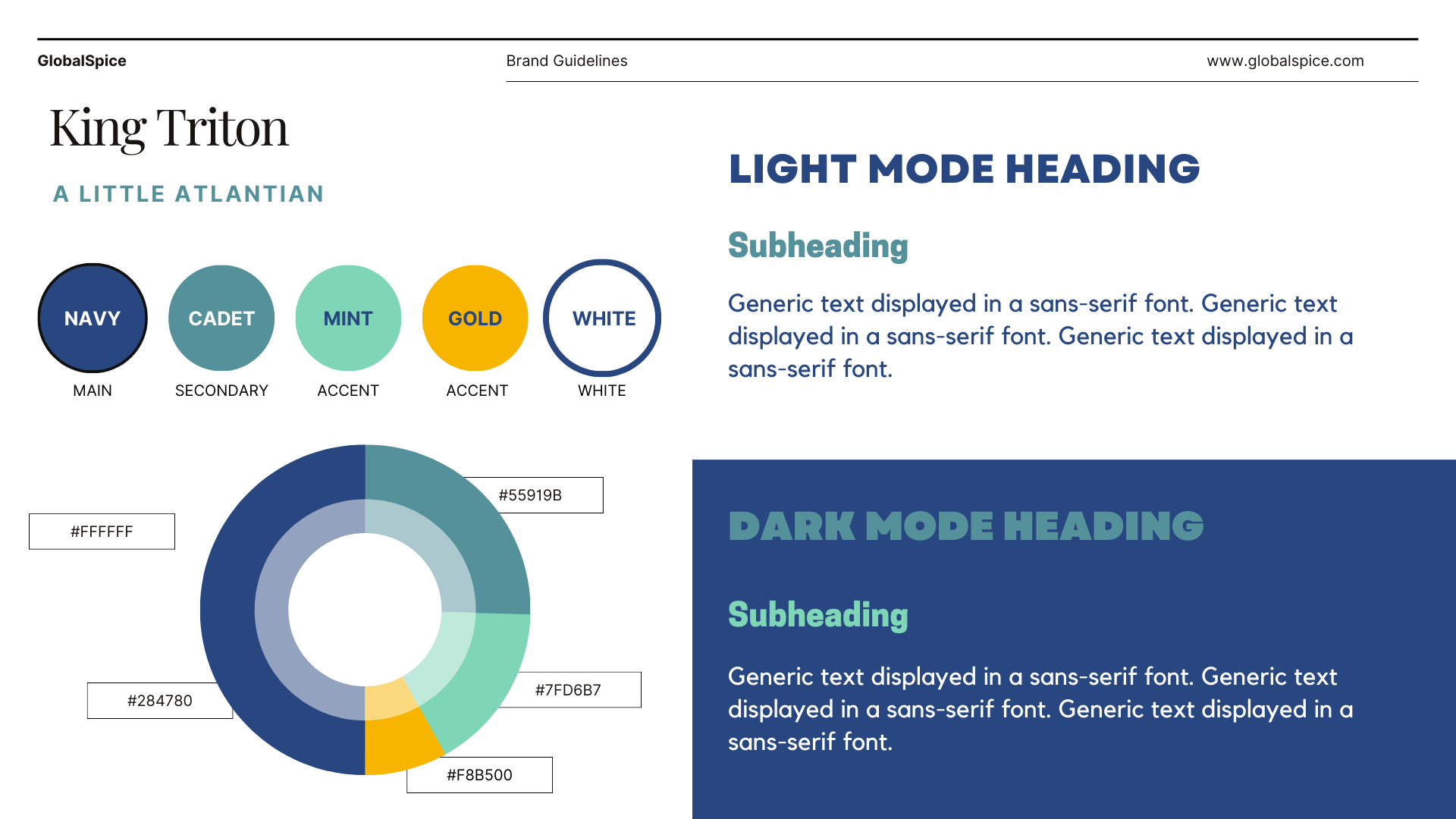
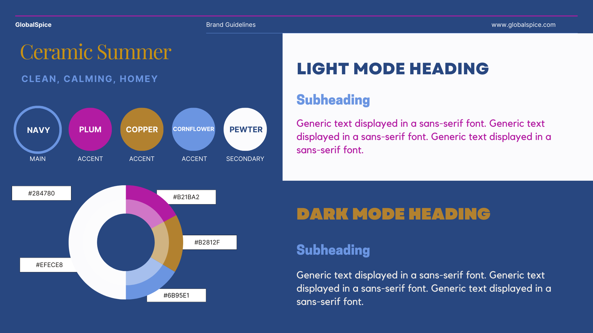
AUTHENTIC COLORS
Survey participants wanted colors that reflected their cultures and were associated with cooking and food.
VIVID IMAGERY & CLEAN SCREENS
Both users and customers wanted more images across the site (besides the products in the shop).
hi-fi prototype
After finalizing the layout of each feature and deciding on the visual design direction, I was ready to create my hi-fi prototype.
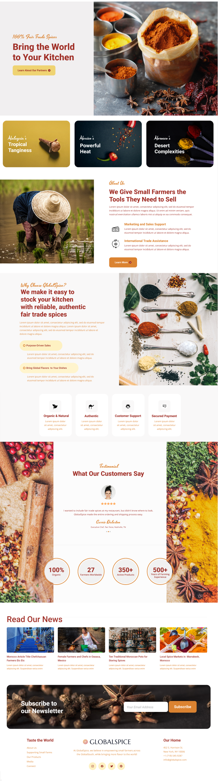
HOME PAGE
The final version of the GlobalSpice homepage focused on telling the company’s stories and featuring lots of imagery.
Organization by country is featured above the fold.
A new testimonial section gave the homepage more social proof.
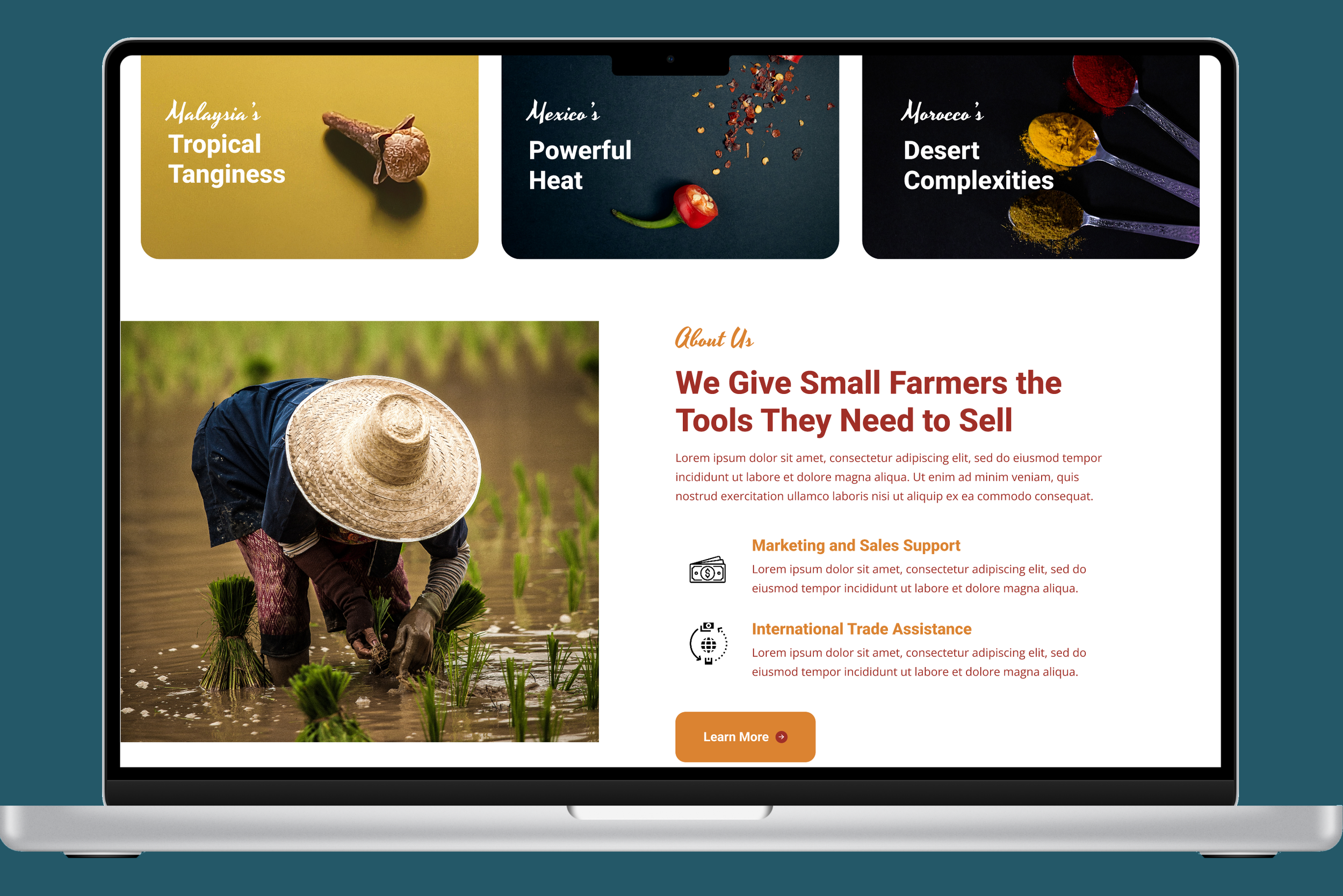
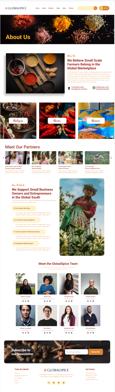
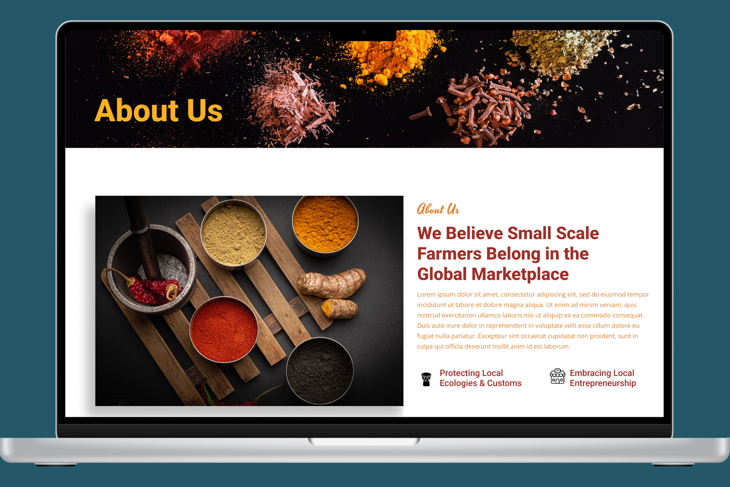
ABOUT US PAGE
Company values that resonated with both users and partners were featured above the fold.
Reordering of the sections moved content relating to countries and partners ahead of company services.
Original wireframes included national team members on the About page. Subsequent versions have simplified by moving in-country teams to their respective country pages.
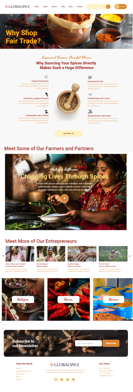
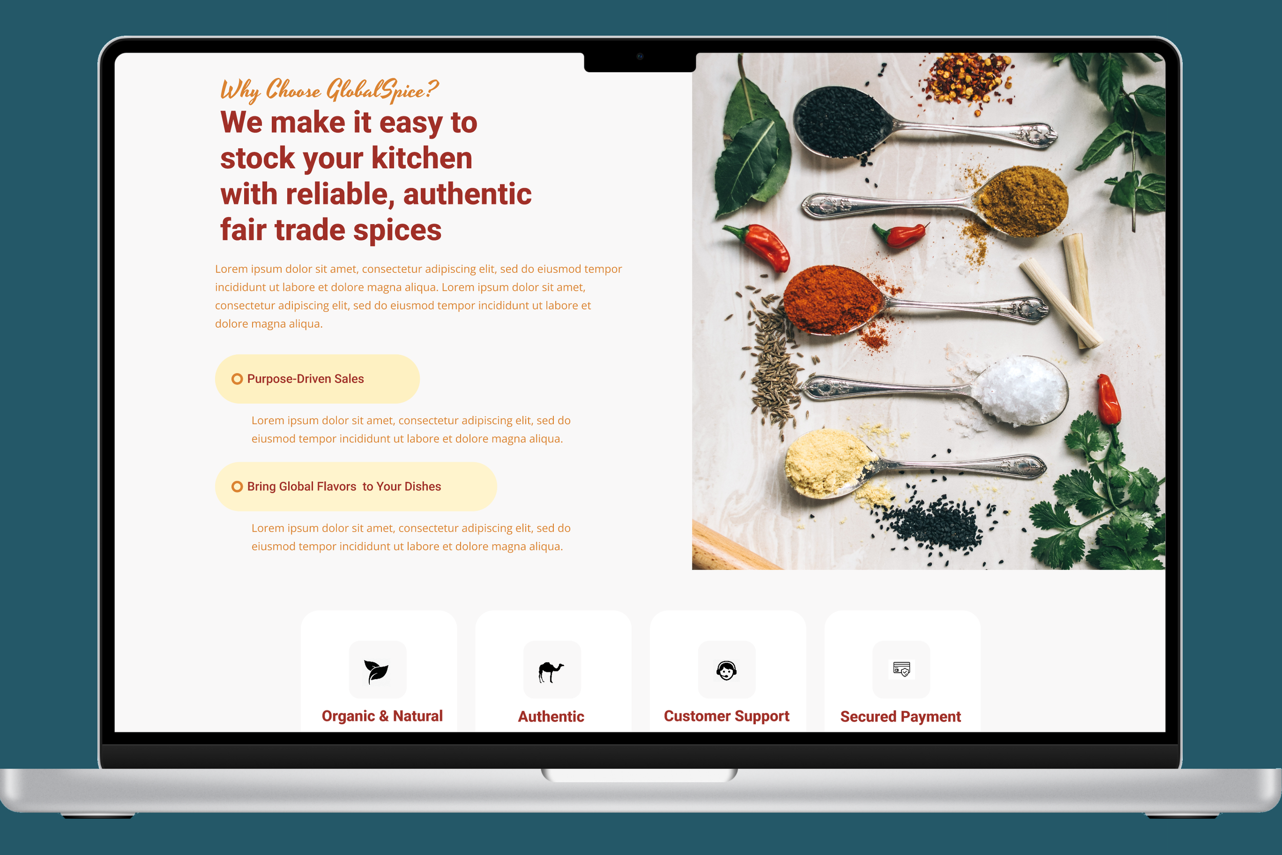
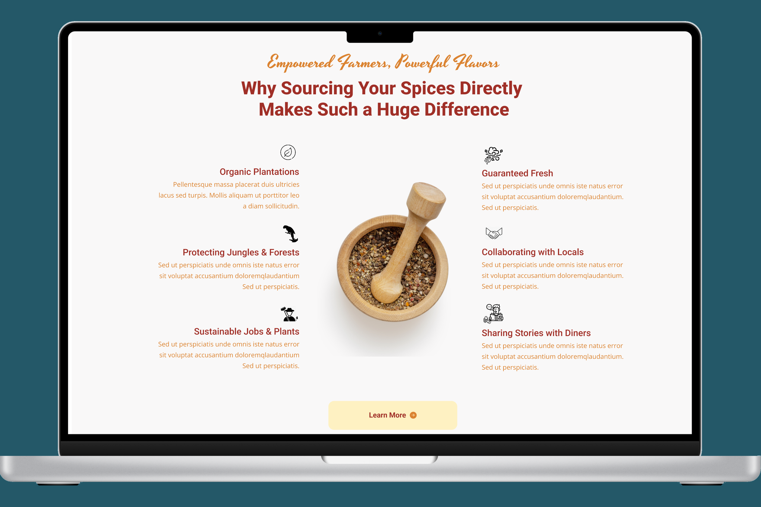
WHY SHOP FAIR TRADE? PAGE
I designed the narrative page with clean visuals and lots of SEO copy above the fold.
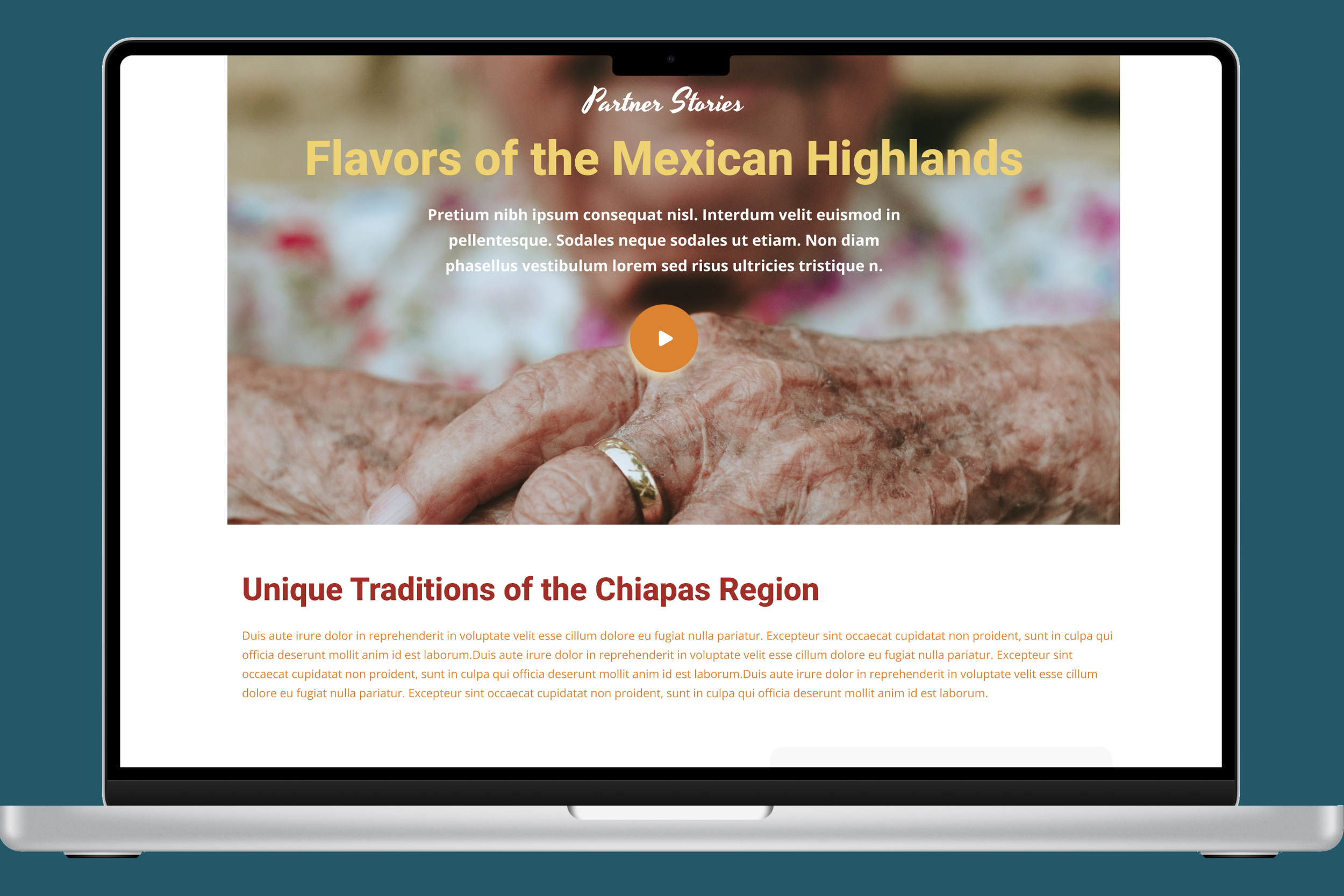
Further down, GlobalSpice is able to feature a new promotional video they’ve developed, making the page more sticky as users move to the partner listings.
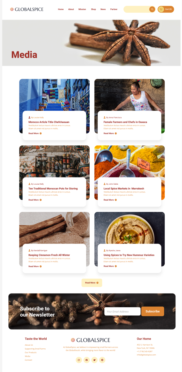
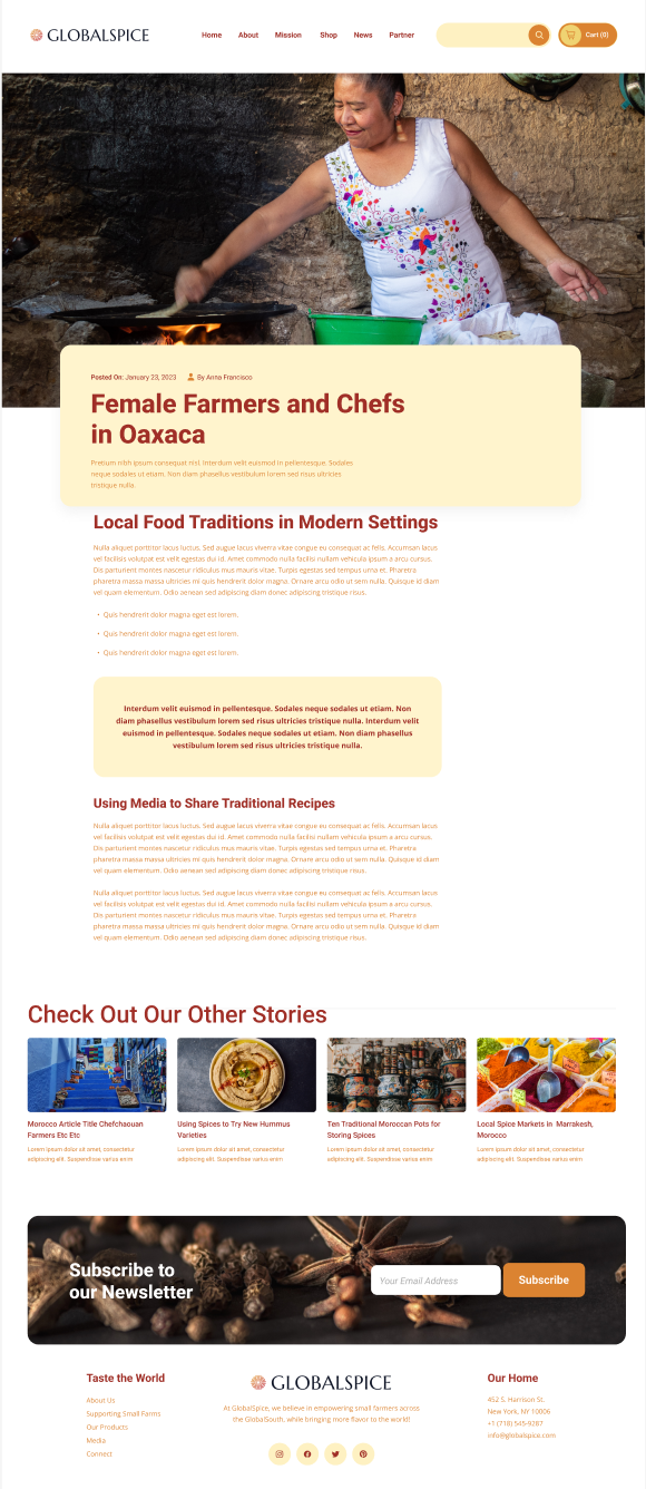
MEDIA PAGES
In order to increase opportunities for GlobalSpice to feature updates, new partners, and visual content, I created a simple news page.
I also developed a template for adding these articles so that marketing reps from each country can add new content easily.
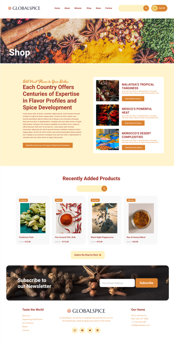
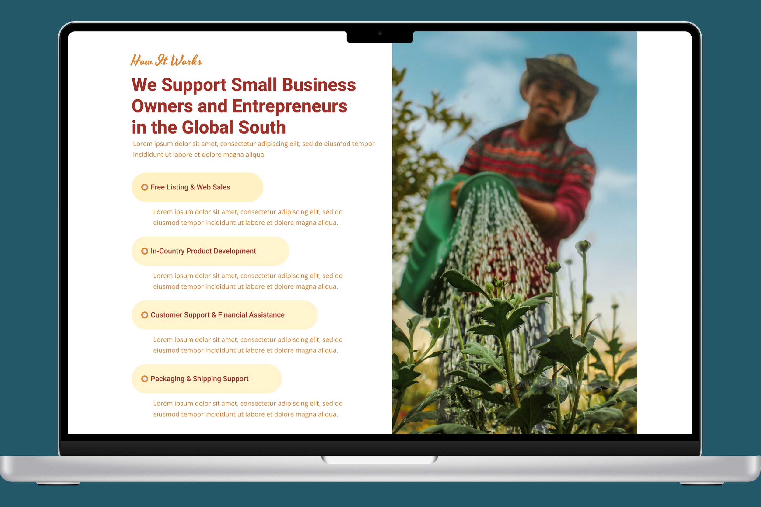
MAIN SHOP PAGE
Initial hi-fi prototypes of this page included a much larger set of products on display. But users felt overwhelmed by too many offerings.
Instead, recent products were featured, along with search and expansion signifiers.
This page also now features all three countries in a comparison format, along with space for SEO-focused text to draw more organic searches to the page.

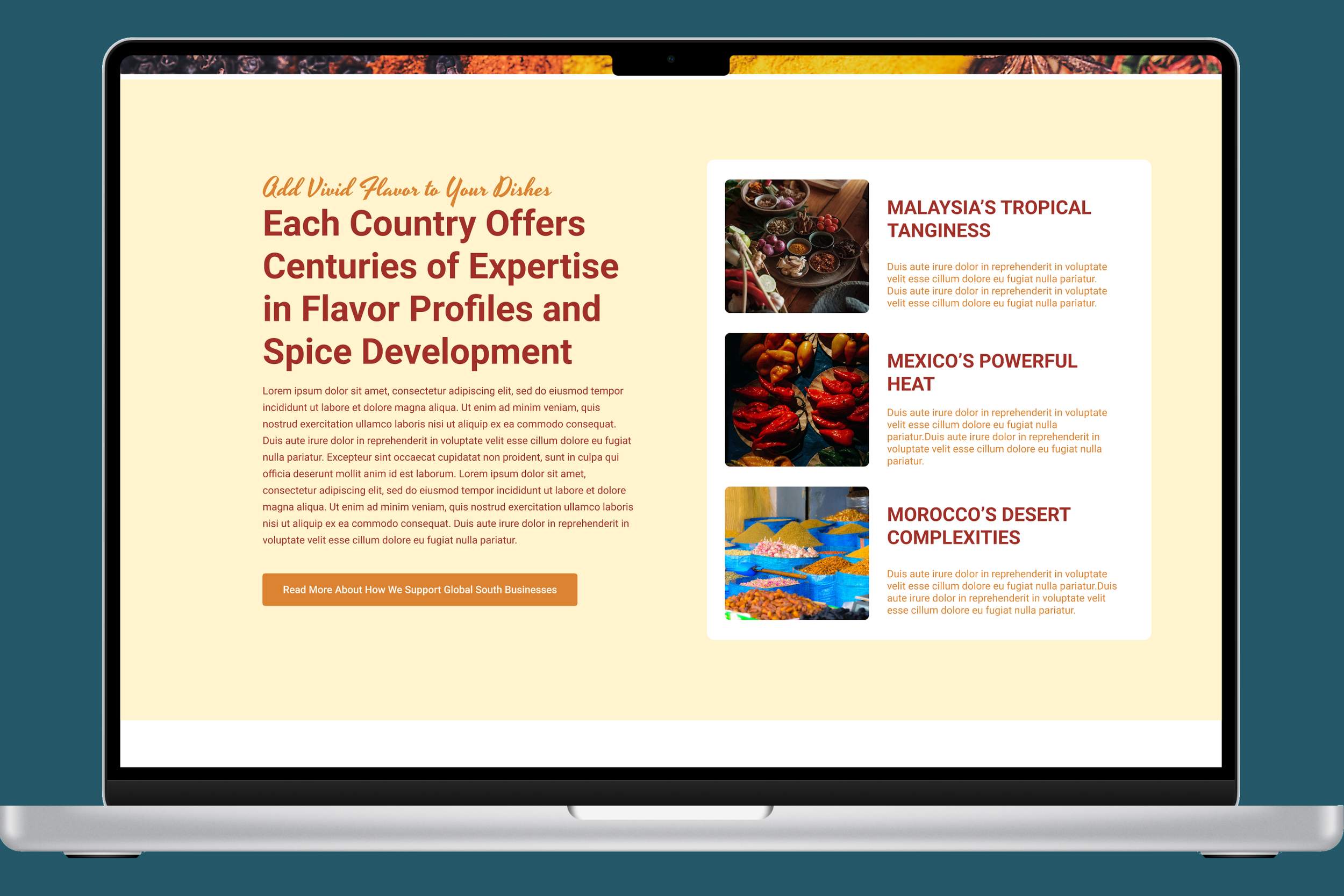
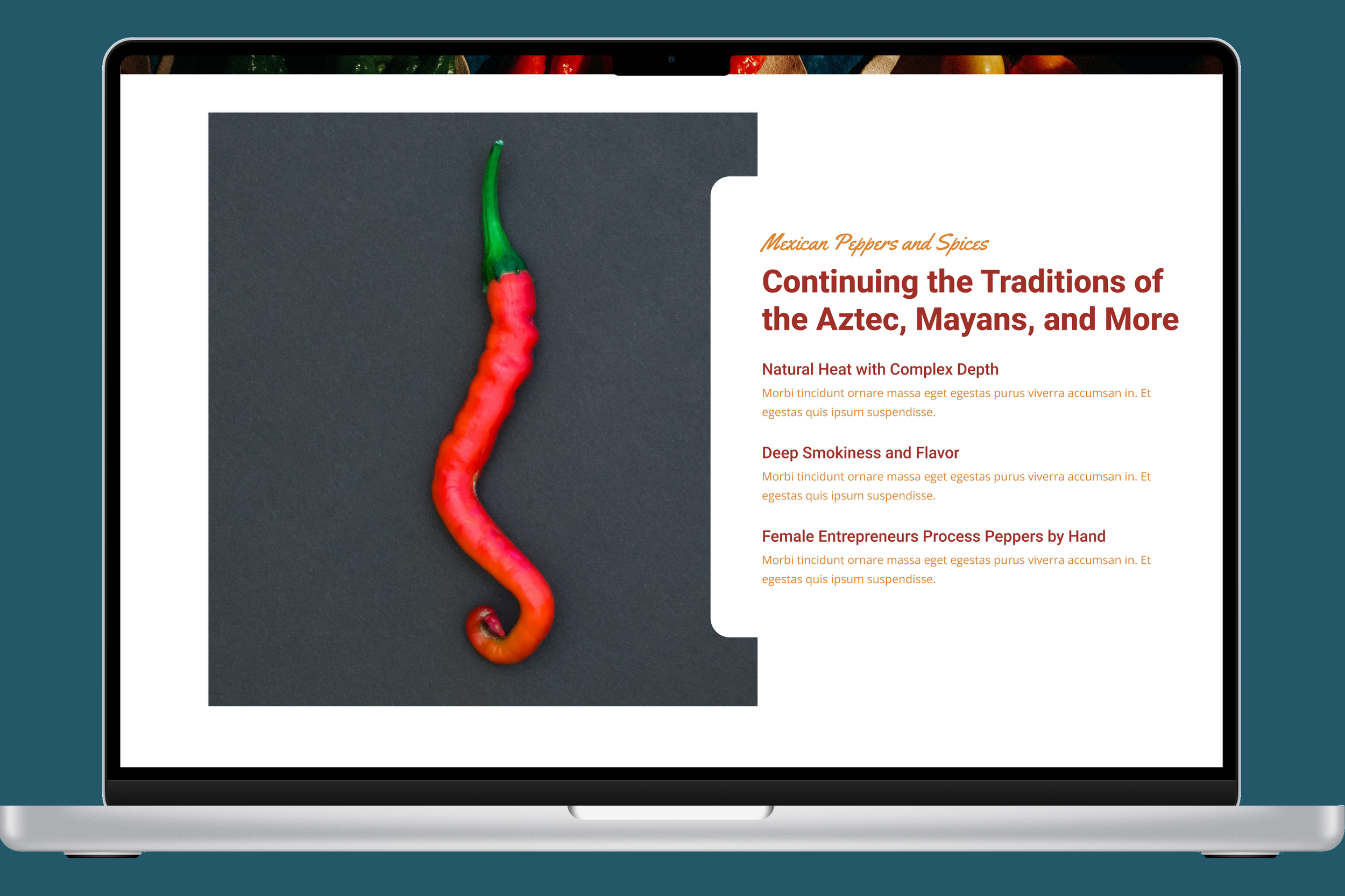
MEXICO SHOP PAGES
Usability testing with the hi-fi prototype revealed that users did not like having too many product images displayed on this page: they expressed feeling overwhelmed. Instead, I’ve limited the initial content on display, but included additional search and expansion signifiers.
Because users described a desire to order all their products from a single partner, individual product pages now include other products from the same seller to make it easier to put together a complete order.
Country pages also include storytelling and narrative aspects to support user marketing inspiration.

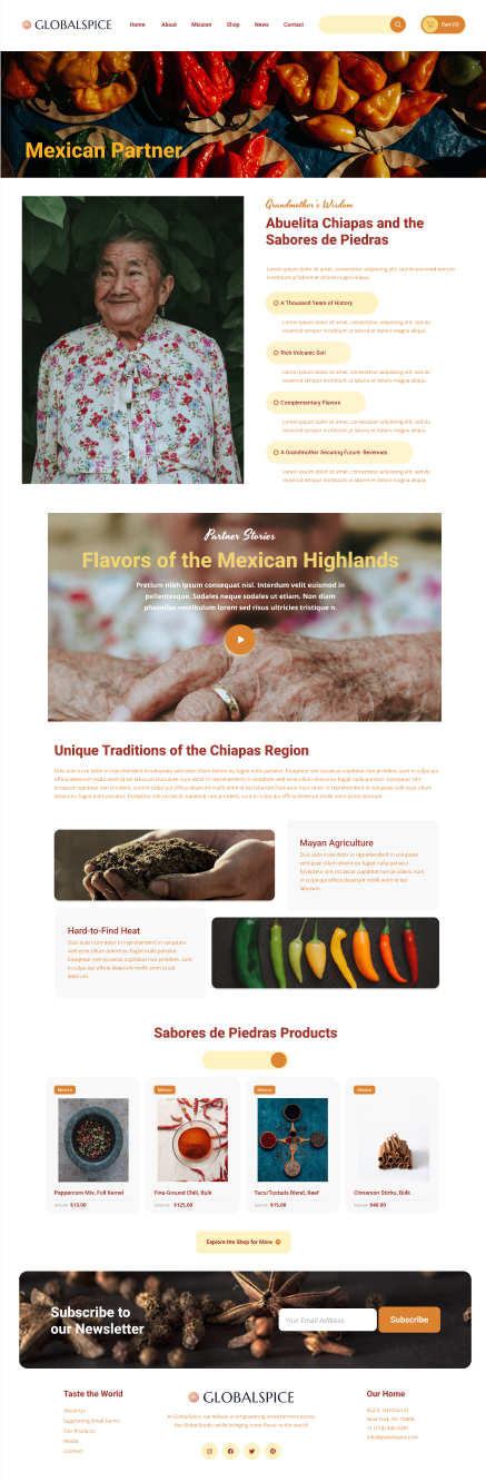
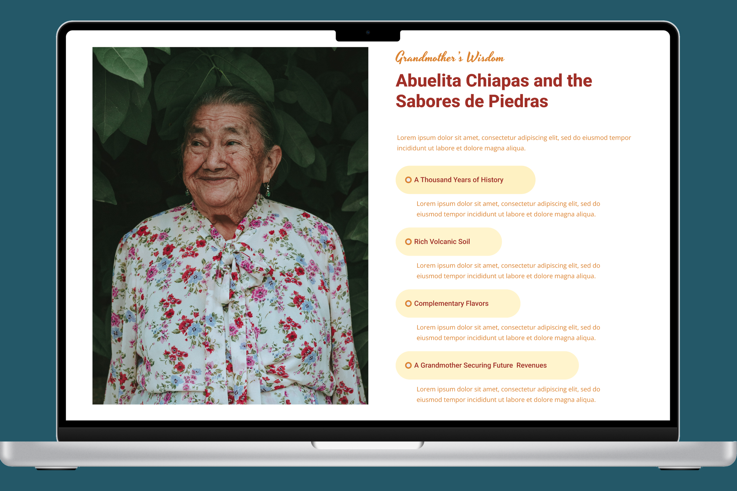
MEXICAN SHOP PAGE
Partners were extremely pleased with the partner page that has been developed for them to feature their stories.
The page emphasizes visual elements and offers multiple spaces to add personalized content.
Partners also liked that they get to feature their products directly on the page, with search functions being limited to that partners’ products.
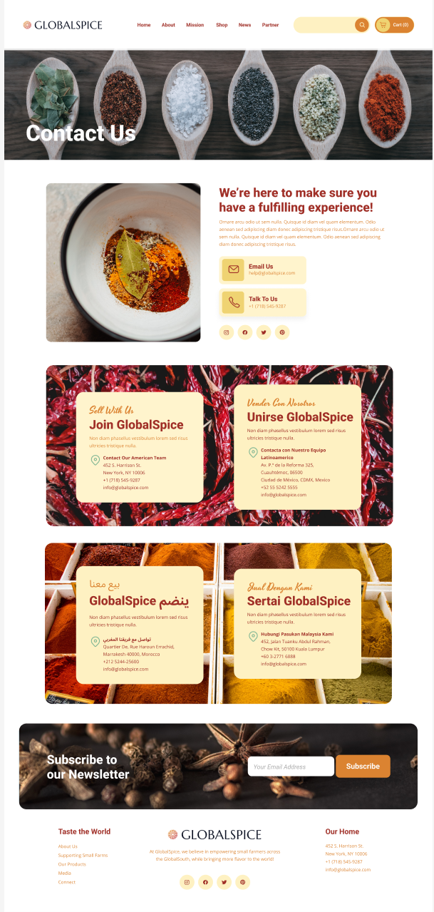
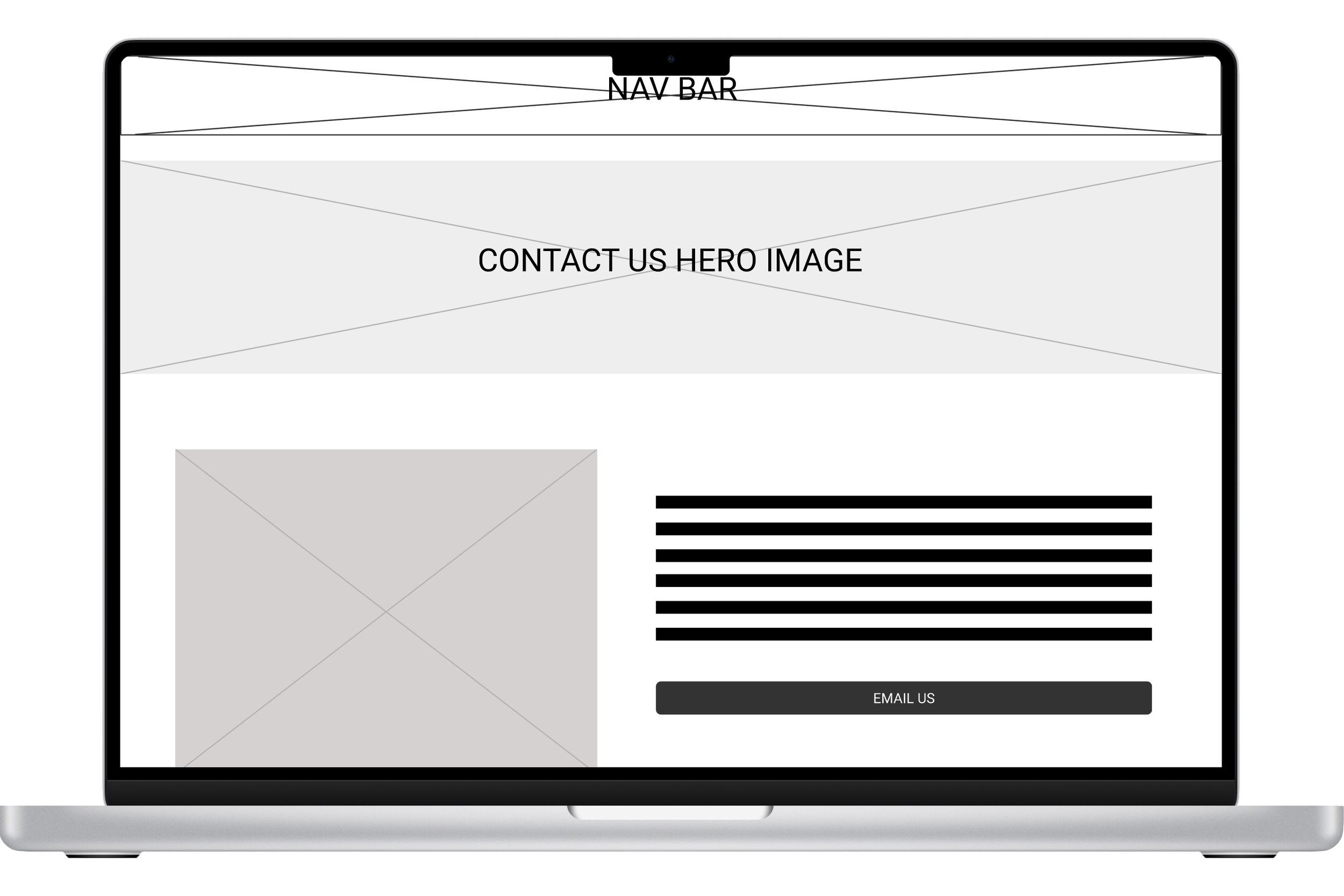
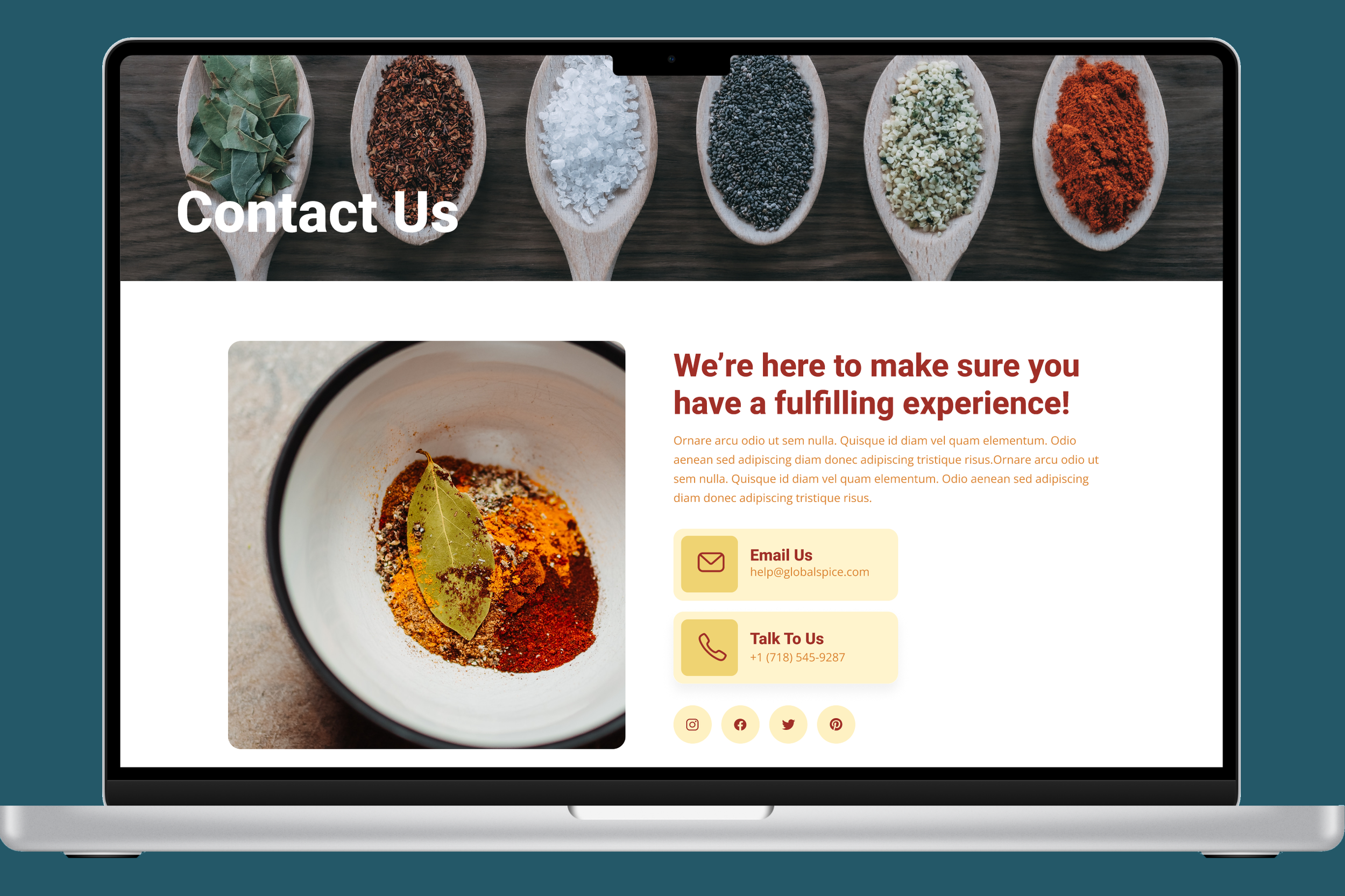
CONTACT PAGE
Initial designs were popular with users and partners, but I decided to add additional contact information in different languages for potential new partners.
The client was excited about the possibilities this opened to use the page in new partner recruiting.
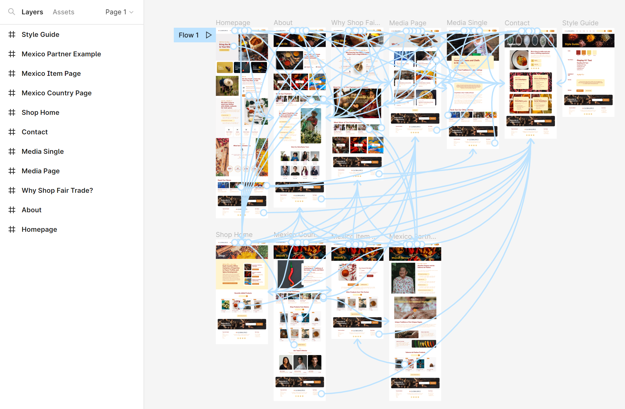
FINAL PROTOTYPE
After several rounds of usability testing (with customers, partners, and the client), a final prototype was completed and passed to the client.
With its new focus on story-telling and a reorganization that emphasized user needs, GlobalSpice’s desktop is refreshed and ready for new business.
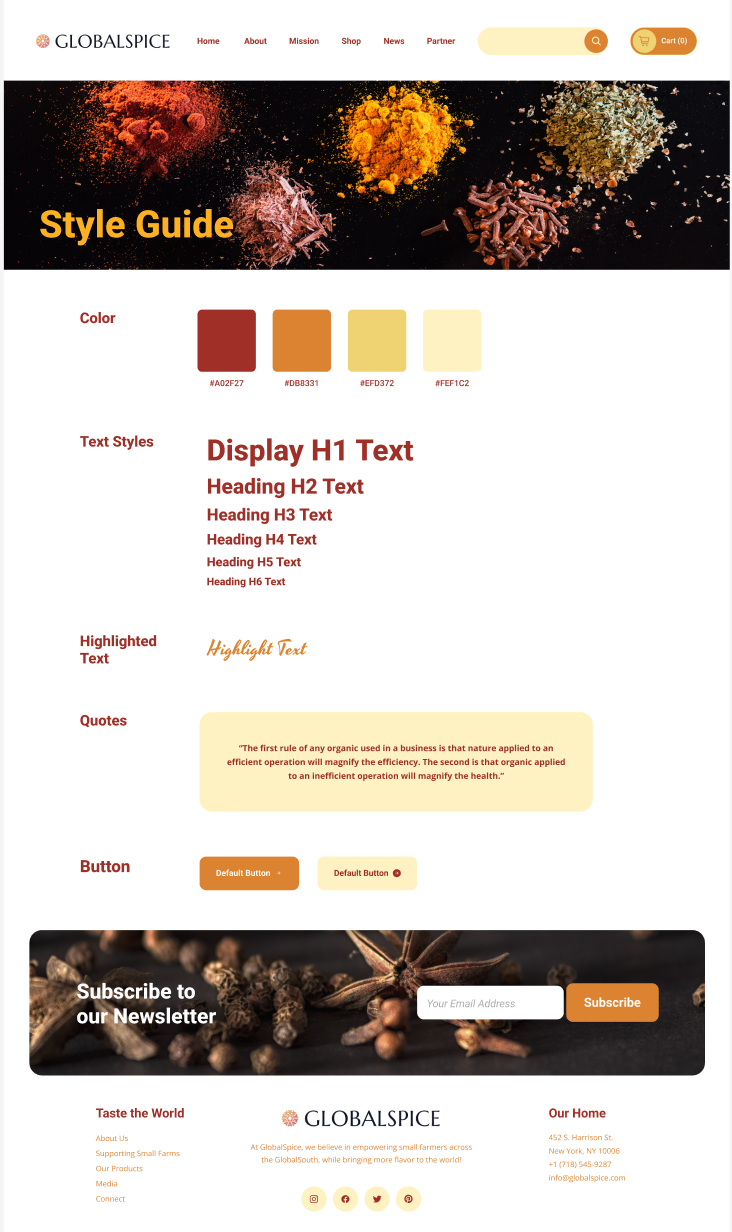
A style guide for future design was developed.