Renois Gallery Exhibitions App
Goal: Design an addition for the Renois Gallery’s existing app that displays past, current and future exhibitions, including a virtual tour.
Roles: I served as both lead UX researcher and lead UX designer for this project. Responsibilities included:
Conducting interviews, developing user stories and personas, and conducting usability studies
Paper and digital wireframing, low and high-fidelity prototyping, accounting for accessibility, addressing usability study insights, and iterating on designs
Project length: 2-week sprint
Client: The Renois Gallery is a small, three story art gallery located in an up-and-coming neighborhood of a major metropolitan area. The Renois Gallery strives to provide an intimate and responsive venue to allow visitors to connect with art. It offers a wide range of dynamic, impactful art exhibits, with a wide range of artistic styles, often curated by local artists and scholars. Renois Gallery targets urban and suburban local residents, as well as tourists visiting the city.
DISCOVERy & definition
USER research
-
Scripted research interviews
Located in USA (remote)
5 participants
30-60 minutes
I conducted interviews to create user personas and journeys, so that we could better understand the target demographic for this gallery app.
A target audience identified through research were tourists trying to decide if a small museum is “worth visiting” while touring the city. This user group confirmed initial assumptions about how they would use the Renois Gallery’s current website/app and how they would also use new exhibition features.
Through this research, several specific pain points were identified, relating to time and accessibility. Research also revealed that users also wanted to learn more about specific artworks and exhibitions on display within the context of the museum itself. These were some of the insights around key challenges and constraints drawn from interviews.
TIME
Busy tourists can’t see everything and have too many choices; they need a meaningful and enticing preview of the Renois Gallery.
DISLOCATION
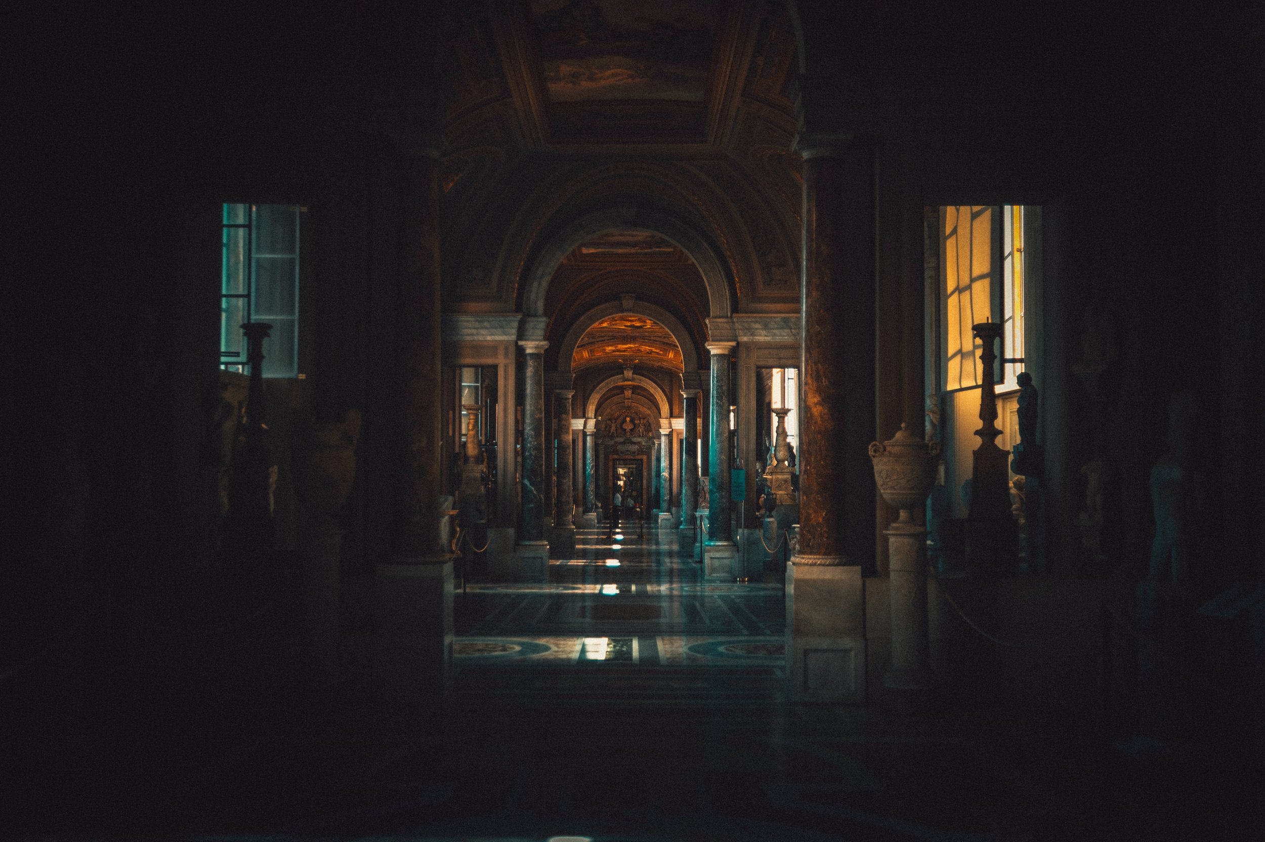
Many virtual gallery websites don’t allow the user to actually feel like they are in the gallery.
LIMITED LEARNING
Users want to learn about artworks and exhibitions, not just move through a generic, unresponsive video.
ACCESSIBILITY
Virtual gallery tours are usually in English and too visually complex or “busy”.
USER persona & journey
The next step was to visualize what the ideal Renois Gallery website user would be like, so that I could design the app to both fulfill the client’s needs but also address the pain points of the user. So, I created the User Persona and User Journey of Sarah the Working Mom Tourist to ensure I was making design decisions solely around her needs, frustrations, and goals.
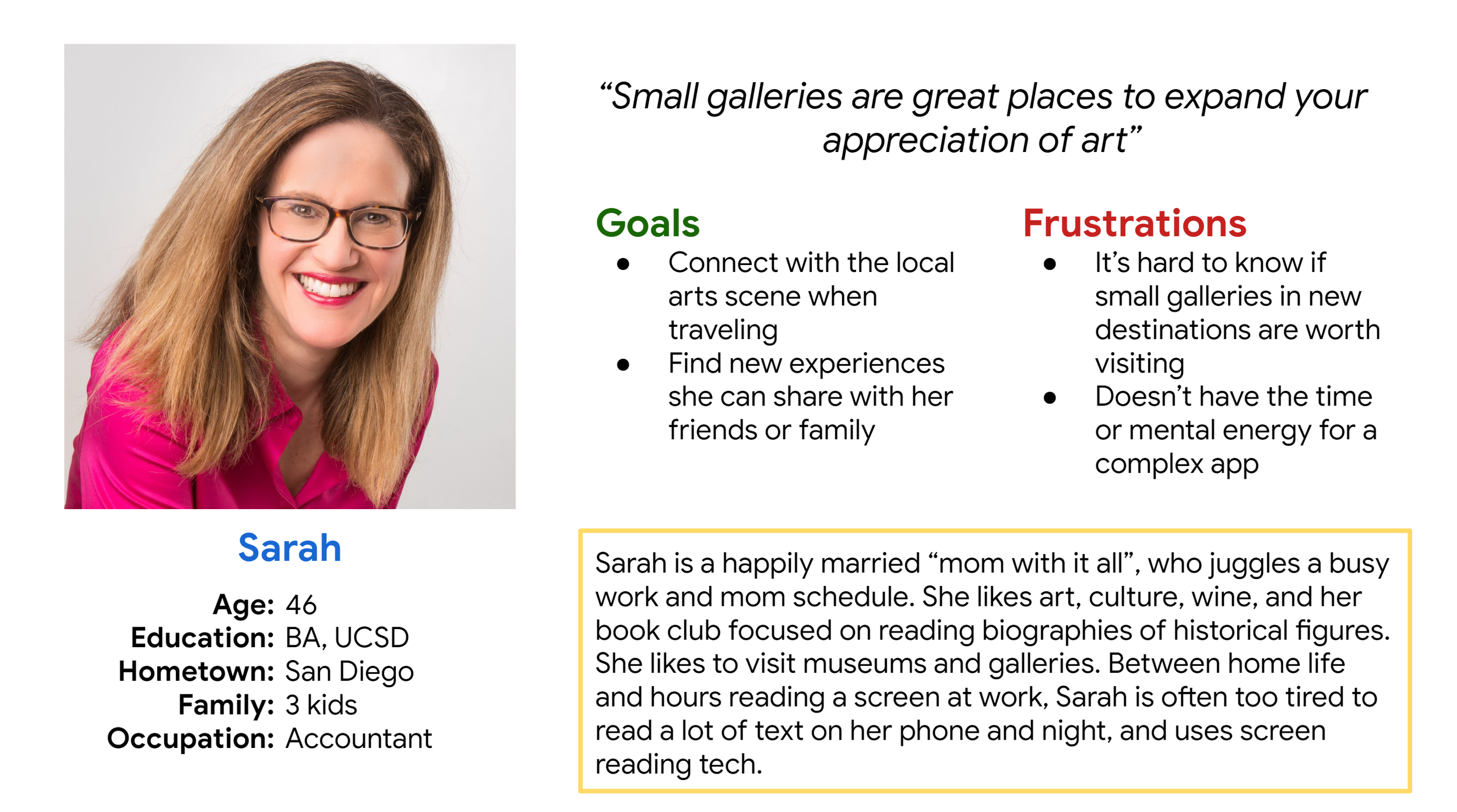

Our Problem Statement: Sarah is a busy working mom who needs an easy way to preview new museum destinations because she doesn’t have a ton of time to plan the perfect vacation.
development
ideation
I did several quick ideations exercise to come up with ideas for how a user would interact with each page. For example, brainstorming exercises revolved around how to show additional information about specific artworks. I focused on making the user feel like they were physically touring a gallery and walking up to a piece of art.
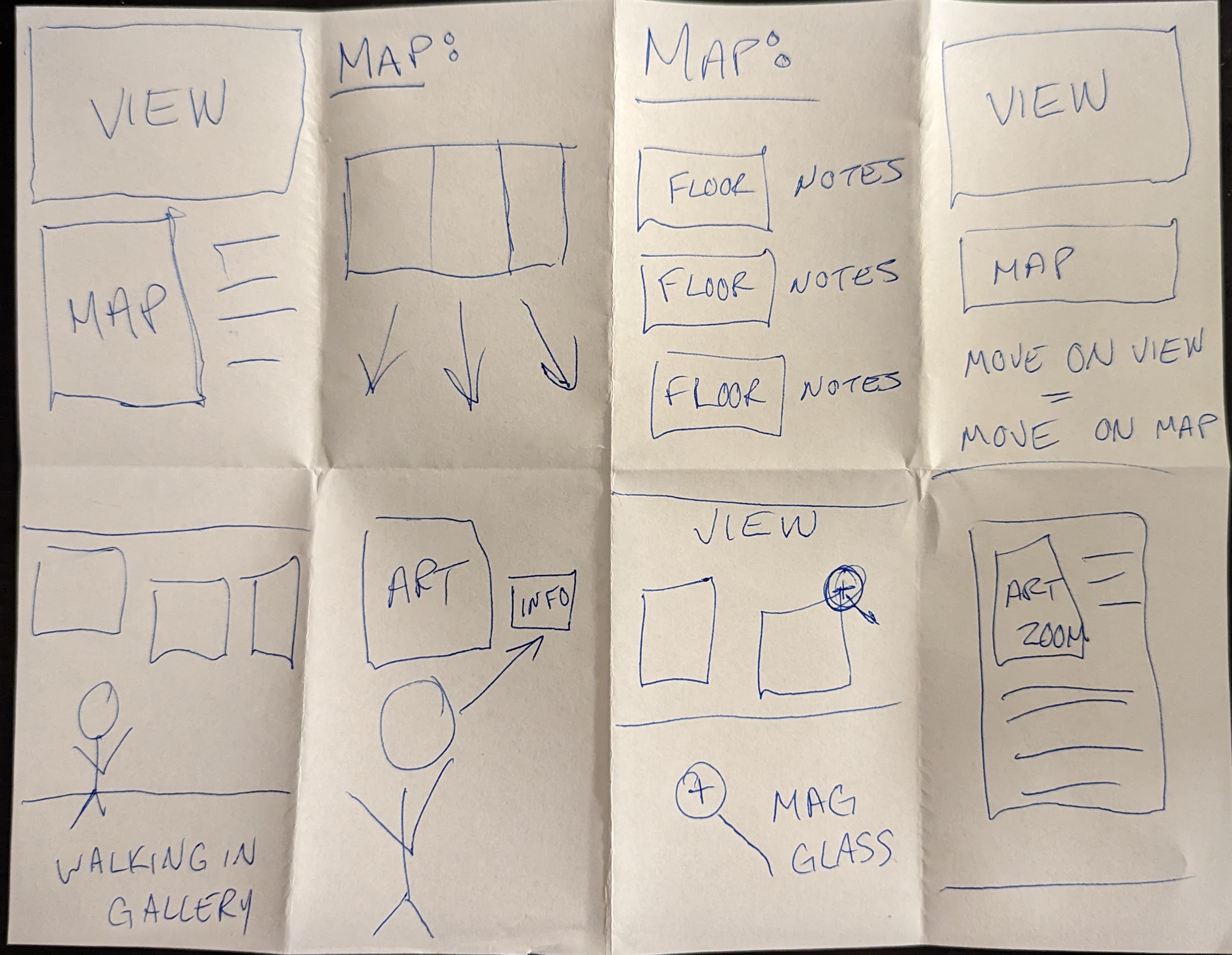
wireframes
Taking the time to draft iterations of each screen of the app on paper ensured that the elements that made it to digital wireframes would be well-suited to address user pain points. For the virtual tour homepage, I prioritized a offering multiple navigation routes with maps and images.
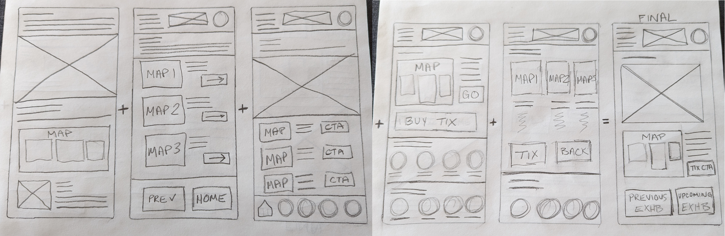
lo-fi wireframes
Paper wireframes were then translate to digital form using Figma. Using the completed set of digital wireframes, I created a low-fidelity prototype to interact with during user testing.
The primary user flow I examined was the virtual tour itself, artwork details, and future exhibitions.
usability testing
-
Unmoderated usability study
Located in USA (remote)
10 participants
20-30 minutes
Once a lo-fi prototype was ready, this was tested through an initial round of usability testing. Subsequent usability testing would utilize a similar format.
Several key insights would shape the final lo-fi prototype, and would be carried into the hi-fi version.
MAP PROBLEMS
Users could not understand how the map relates to the tour images.
ARTWORK DETAILS
Users wanted more language options and better accessibility.
MORE CONTENT
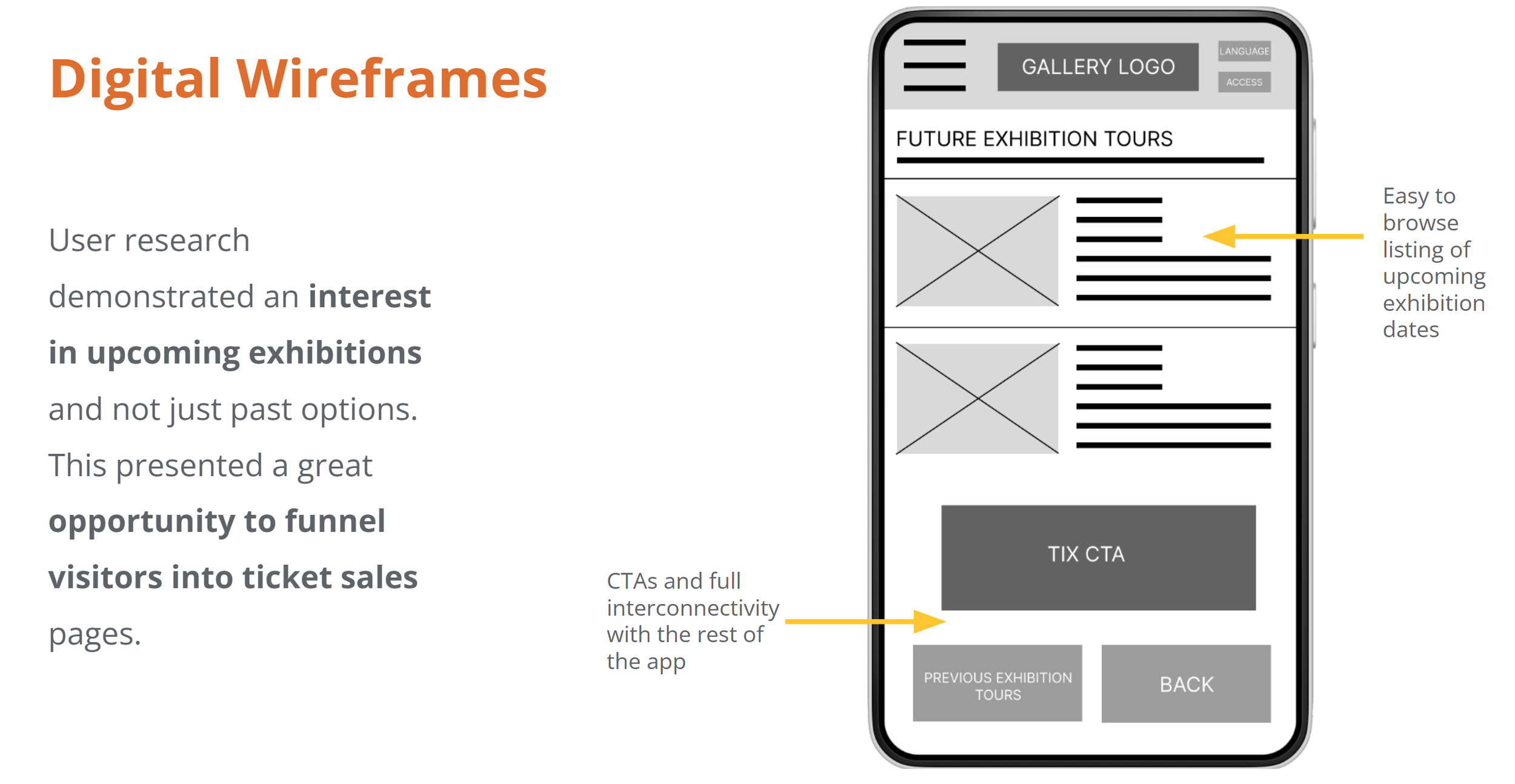
Users want to see future shows, not just past and current exhibitions.
translating insights into prototype
Insights from usability testing were integrated into the final lo-fi prototype.

delivery
hi-fi prototype
After finalizing the layout of each feature and deciding on the visual design direction, I was ready to create my hi-fi prototype.
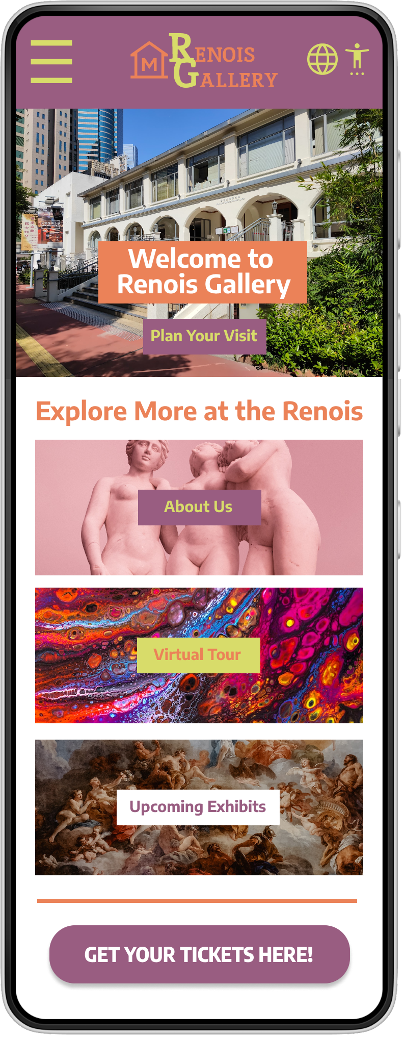
HOMEPAGE
While the gallery already had a main page, it was not providing enough navigational information for the user.
I redesigned the homepage to streamline offerings, drawing inspiration from large competitors like The Met and the MFA.
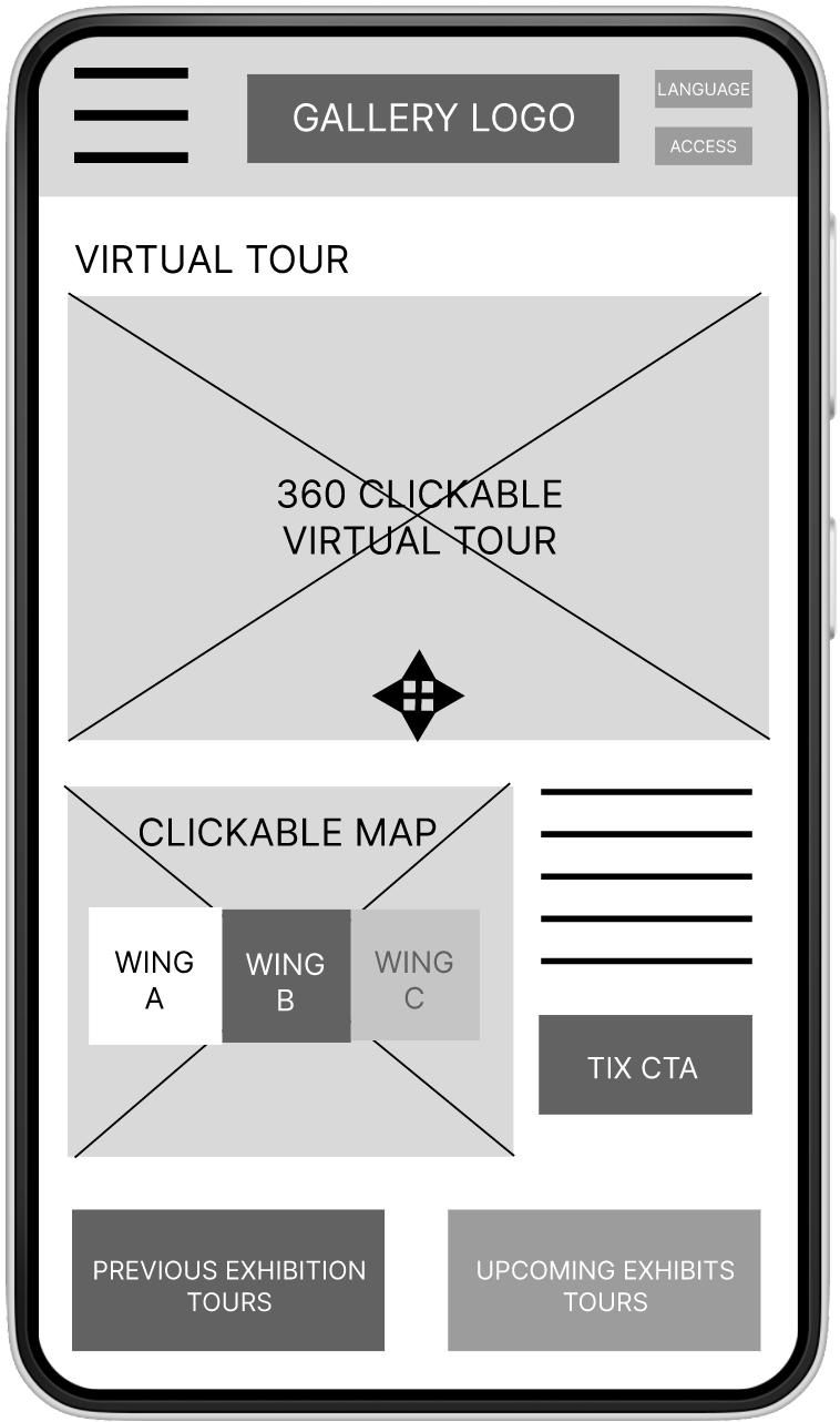
VIRTUAL TOUR LANDING PAGE
Many iterations of the map design were testing to determine the most comfortable layout for users.
Ultimately, the solution was to add directions as well, to increase accessibility for those unfamiliar with the virtual tour format, or preferred using Spanish.

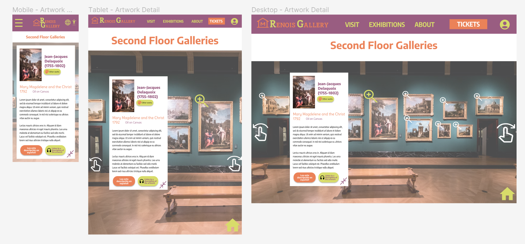
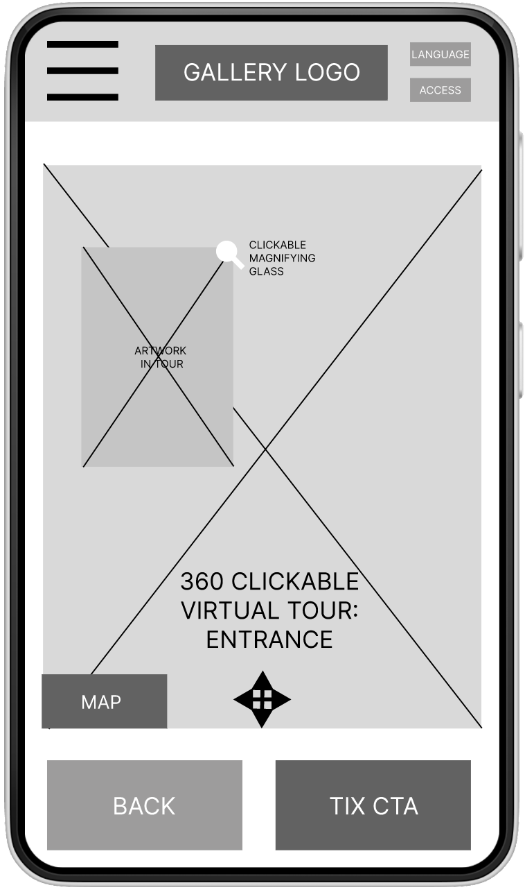
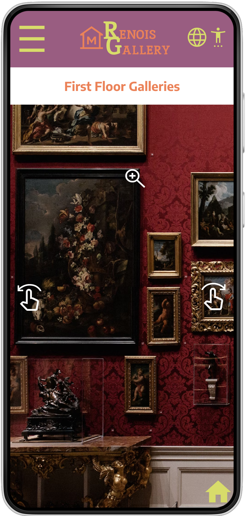
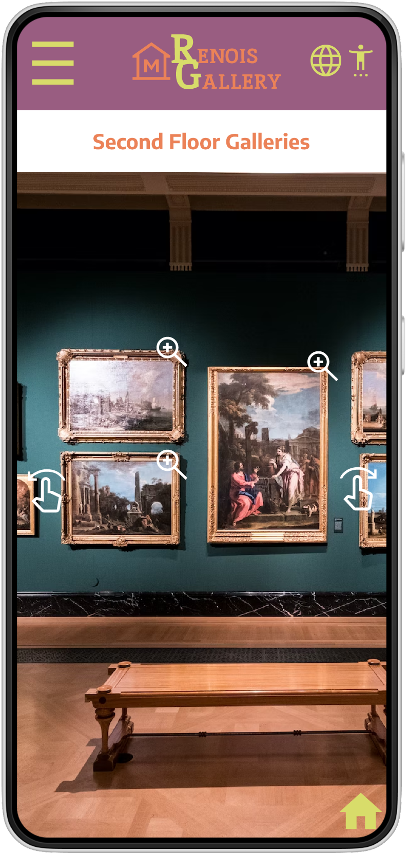
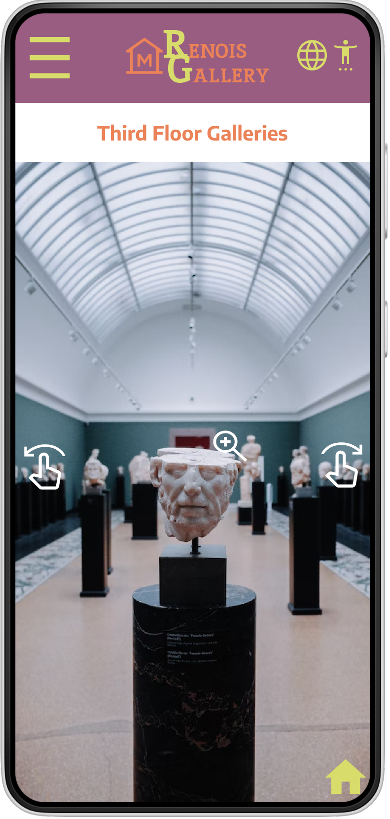
VIRTUAL GALLERIES
Users are able to move freely around the galleries, providing a simulated visiting experience.
Signifiers were kept small and consistent to avoid interrupting the visual experience.
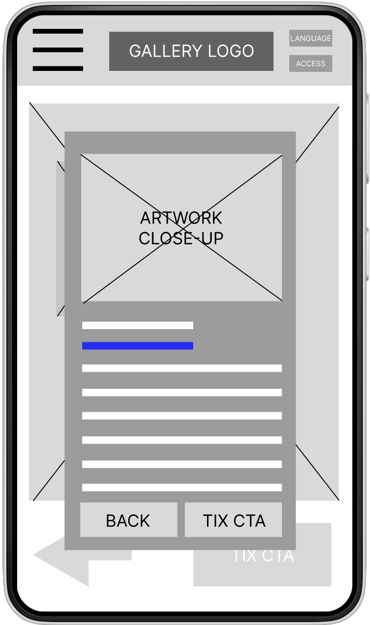
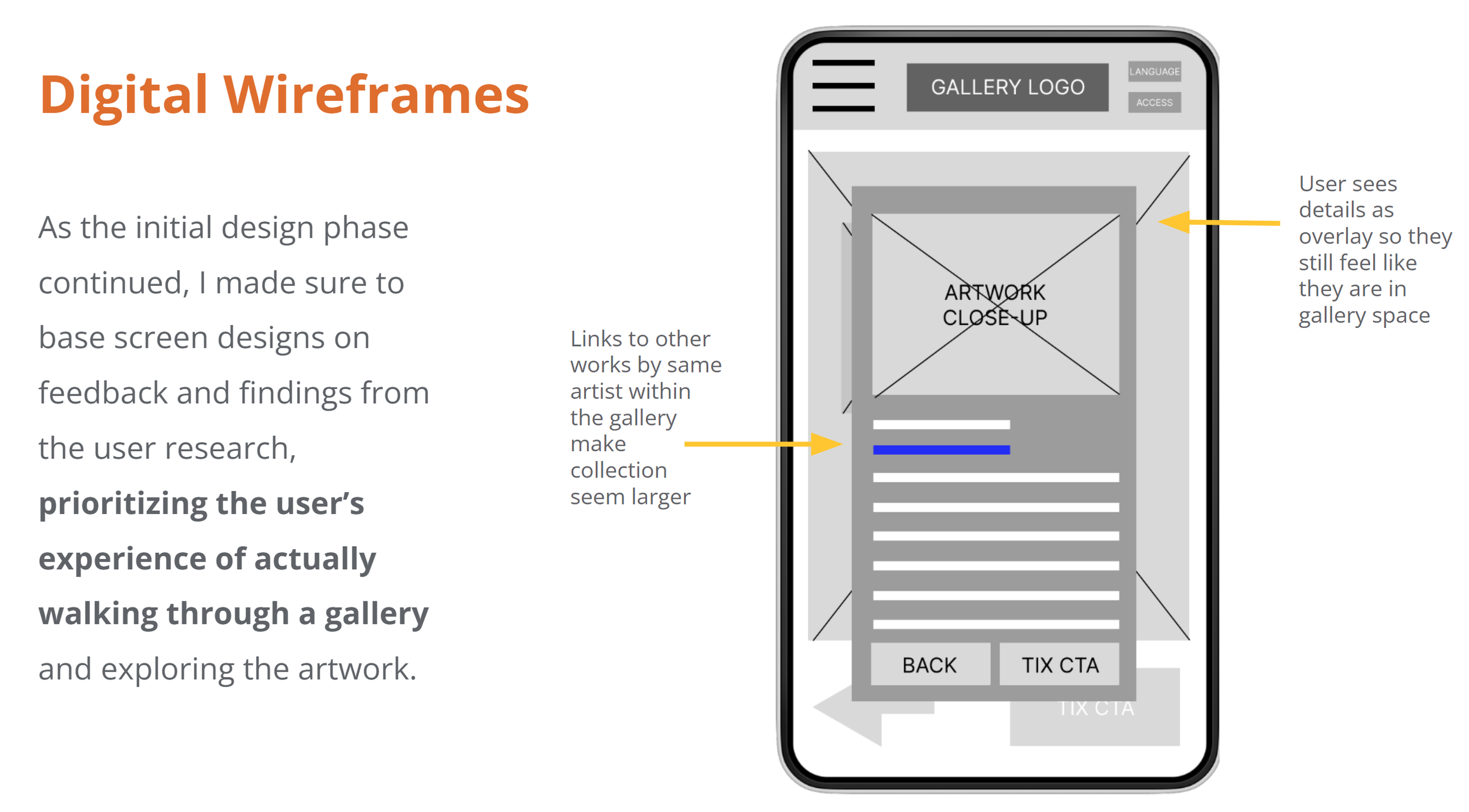
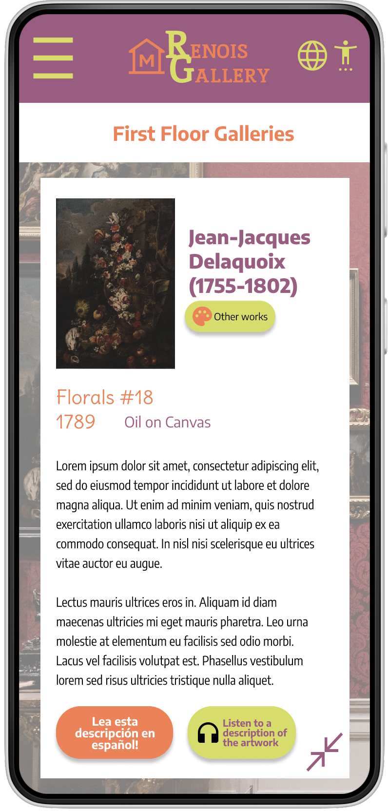
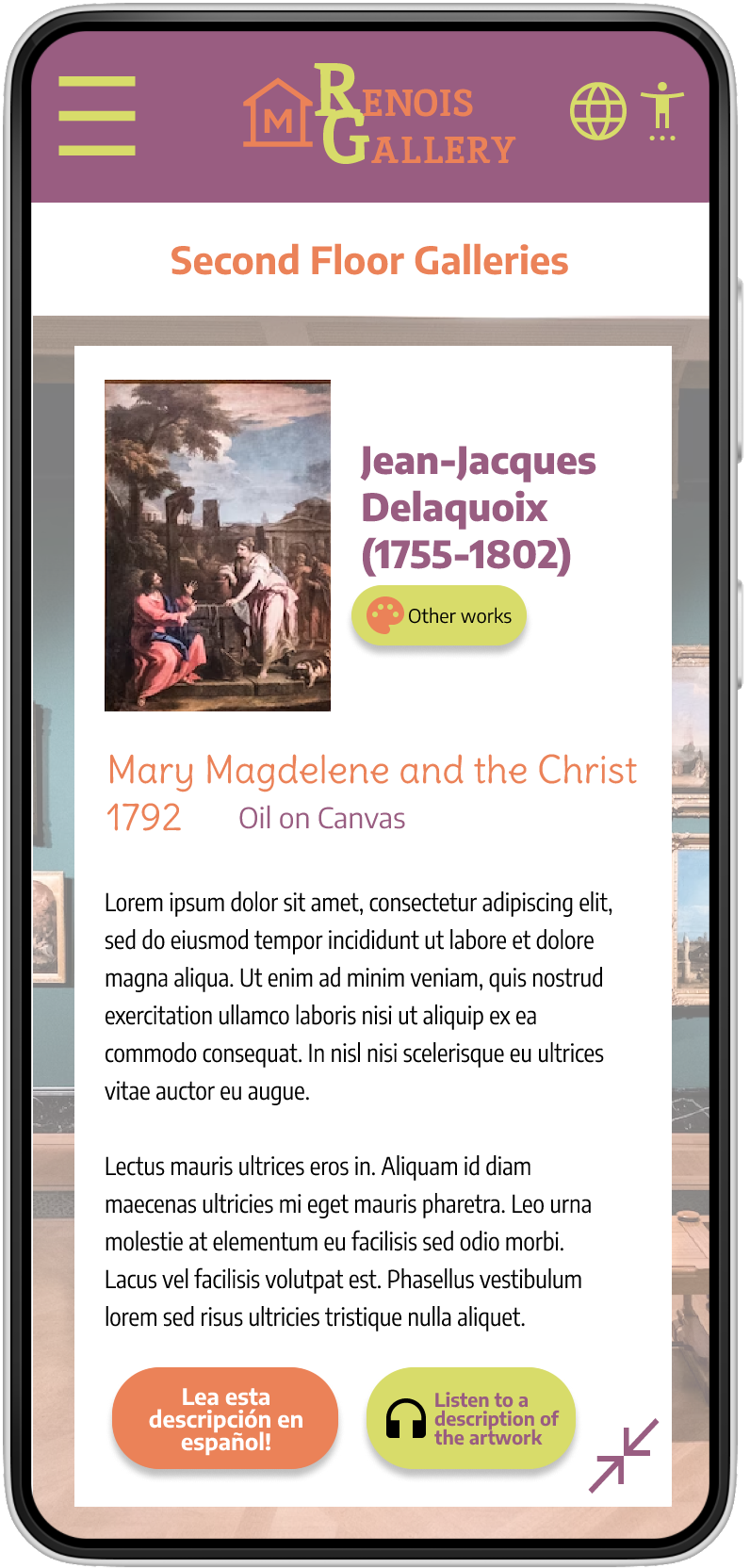
ARTWORK DETAILS
After several iterations, a clean, bright canvas was chosen, and more negative space was utilized.
Works by the same artist are linked through the button, a feature asked for by users and adored by the client. Exploring the collection as a whole is easier than ever.
To expand accessibility, I added new buttons to offer Spanish and audio versions of the artwork. This was a popular feature from the moment it was added in usability testing.
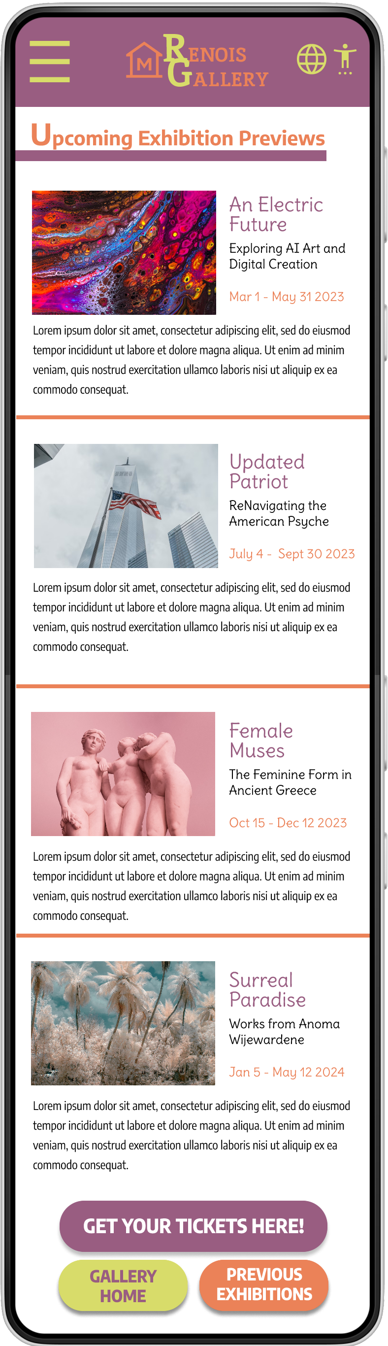
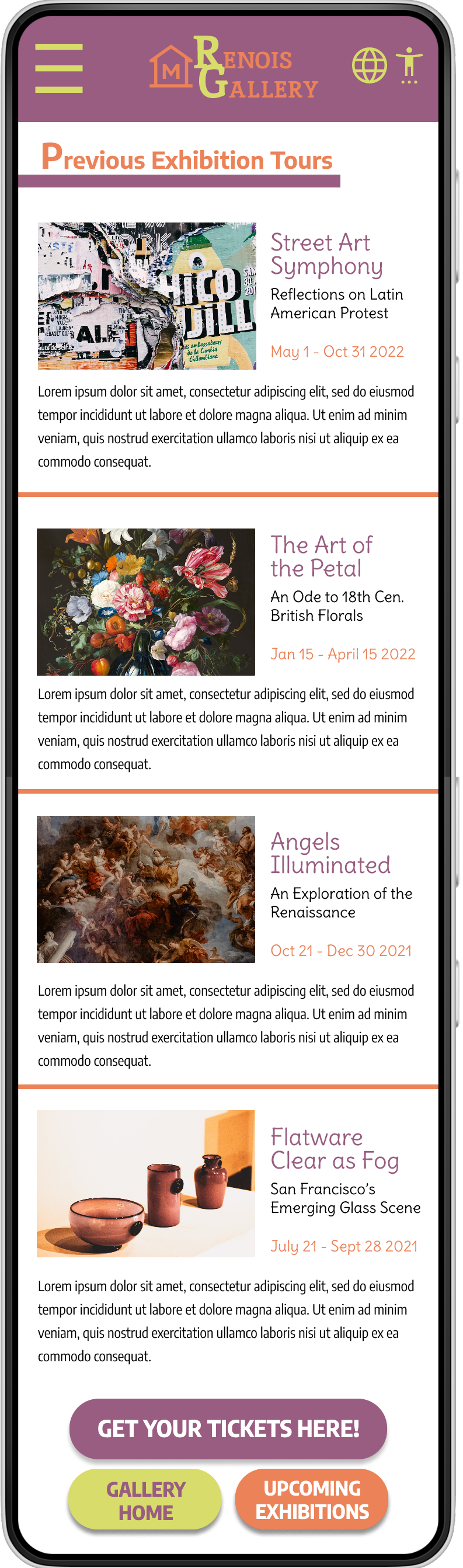
PREVIOUS & UPCOMING EXHIBITIONS
The initial project scope was to build out the virtual tour to show off current exhibitions, and to design a page to show previous exhibitions.
Initial user research and testing showed that users also wanted to see future exhibitions in the same format: at the time, future exhibitions were only being presented in newsletters to subscribers, or in press releases.
The client agreed to a single design for both, along with a standardized template for entering content, to create a more uniform, consistent experience for the user.
One of the next design phases on this project will be designing the template for previous and future exhibitions; this will require more work with the client to determine parameters.
Responsive Design
With the app designs completed, I started work on designing the responsive website. The designs for screen size variation included mobile, tablet, and desktop. I optimized the designs to adjust the overlay to make sense within the overall gallery.